Chef 2 Chef
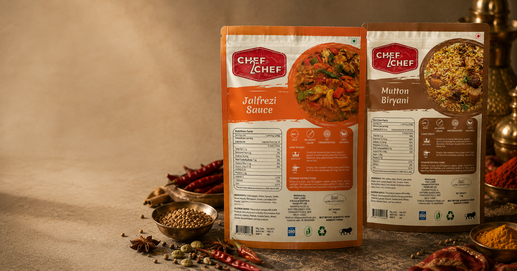
Chef2Chef is a frozen and ready-to-cook food brand based in India, offering a variety of gravies, masalas, sauces and rice mixes. My role focused on creating a cohesive visual identity, logo design and packaging system that simplifies information while standing out on the shelf.
2022
Chef2Chef is a frozen and ready-to-cook food brand based in India, offering a variety of gravies, masalas, sauces and rice mixes. My role focused on creating a cohesive visual identity, logo design and packaging system that simplifies information while standing out on the shelf.
Chef 2 Chef
2022
Chef2Chef is a frozen and ready-to-cook food brand based in India, offering a variety of gravies, masalas, sauces and rice mixes. My role focused on creating a cohesive visual identity, logo design and packaging system that simplifies information while standing out on the shelf.
2022
TIMELINE
8 weeks
CHALLENGE
Design a cohesive brand and packaging system that communicates product information clearly while standing out on retail shelves.
CHALLENGE
Design a cohesive brand and packaging system that communicates product information clearly while standing out on retail shelves.
SOLUTION
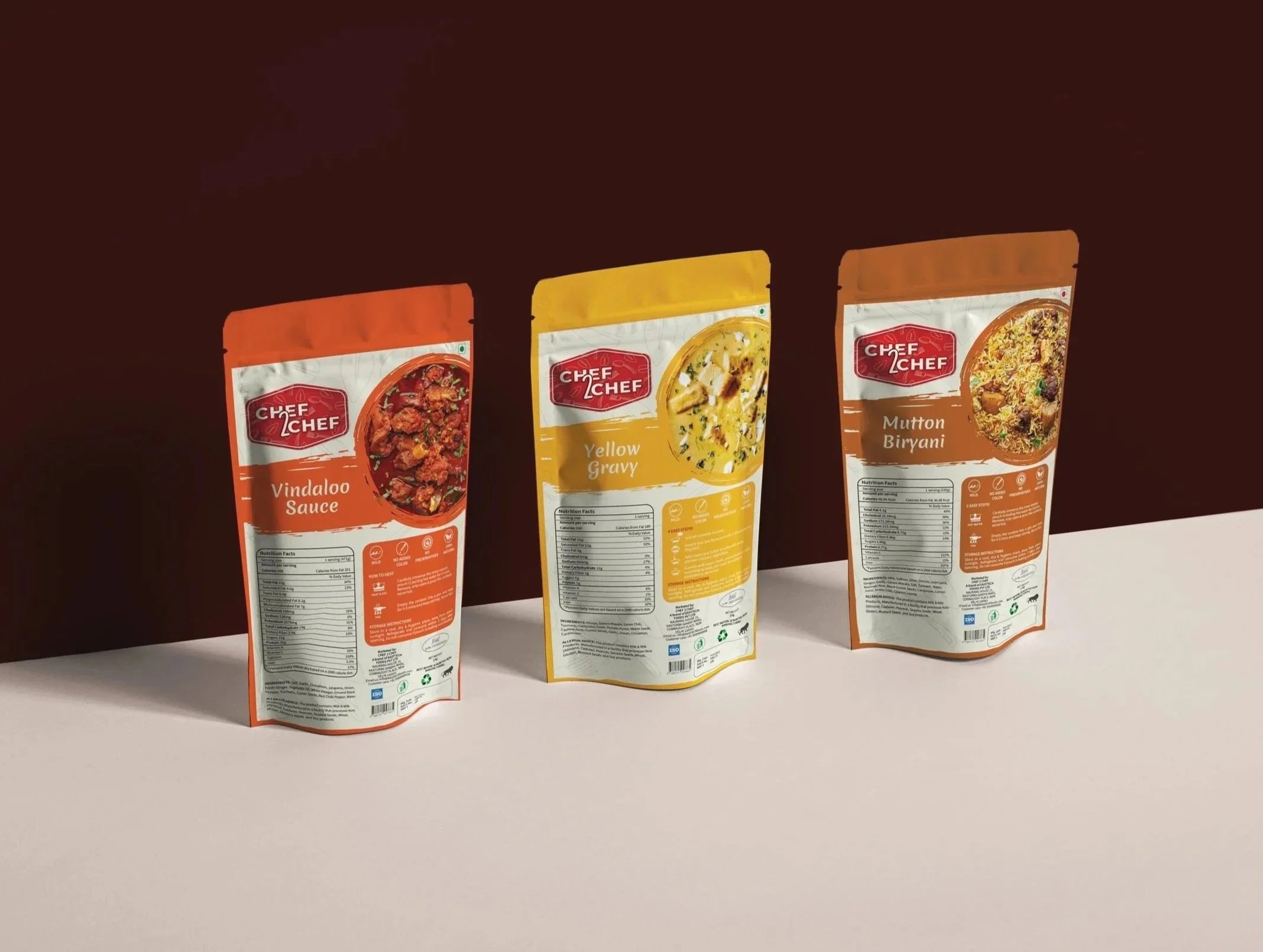
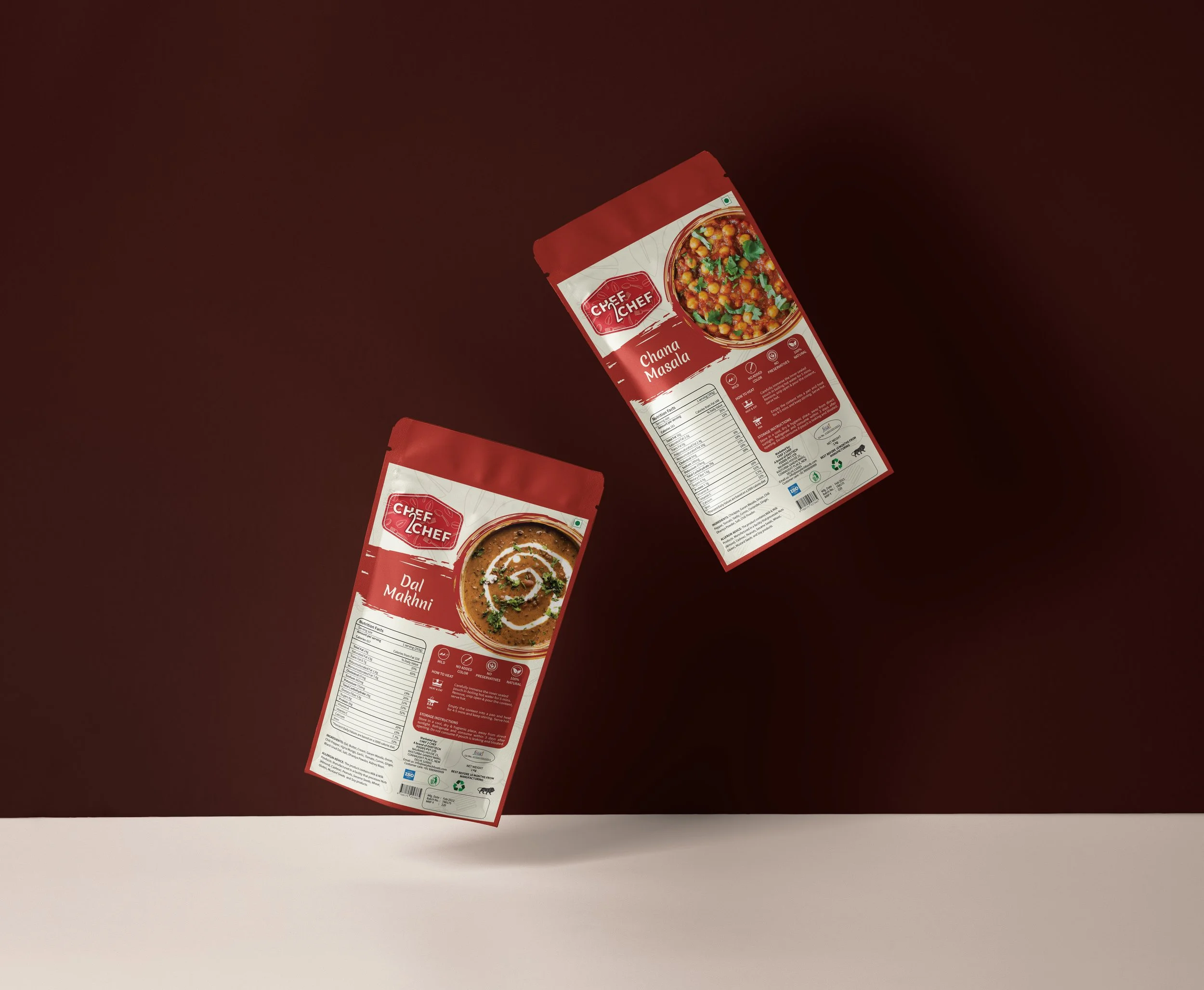
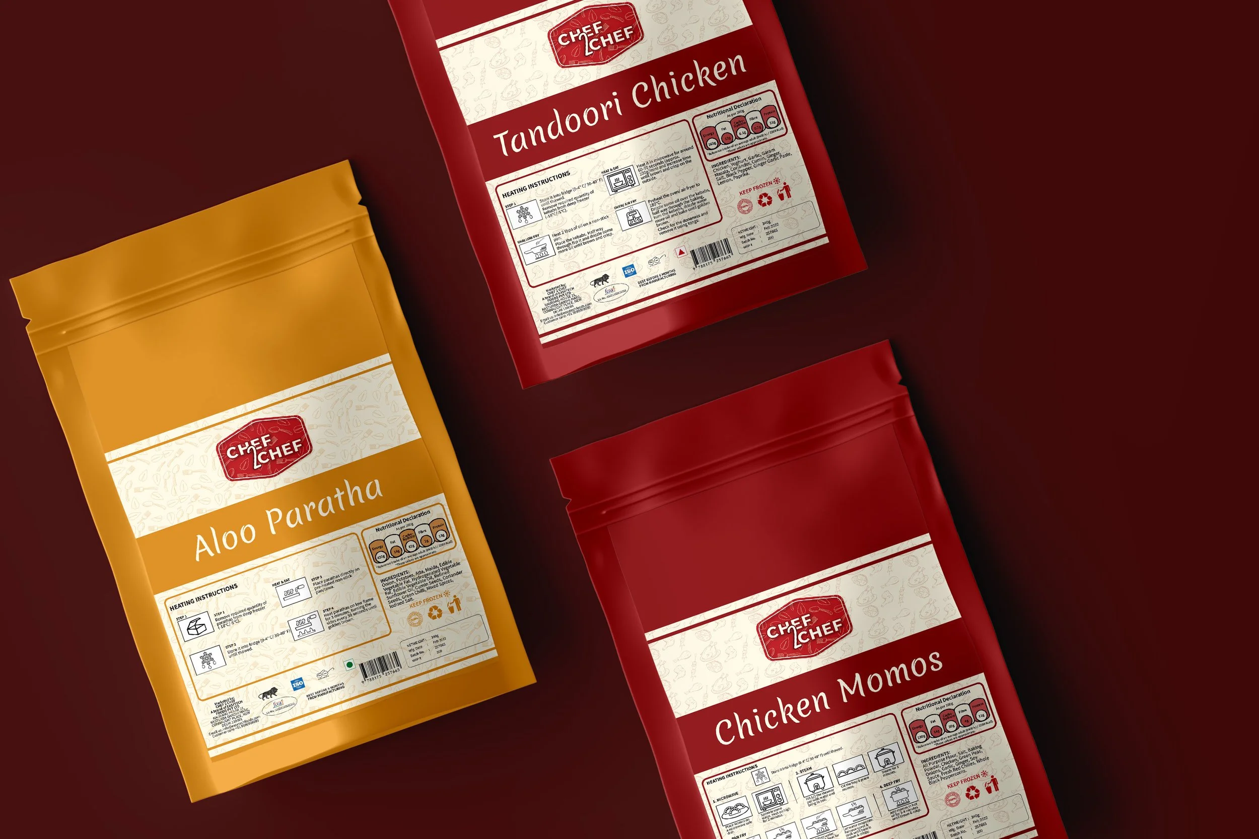
Created a bold brand identity and flexible packaging system with a custom icon set for quick, intuitive communication.
SOLUTION
Created a bold brand identity and flexible packaging system with a custom icon set for quick, intuitive communication.
DELIVERABLES
Logo design, packaging stickers, icon system, and visual assets for a multi-product ready-to-cook food range.
DELIVERABLES
Logo design, packaging stickers, icon system, and visual assets for a multi-product ready-to-cook food range.
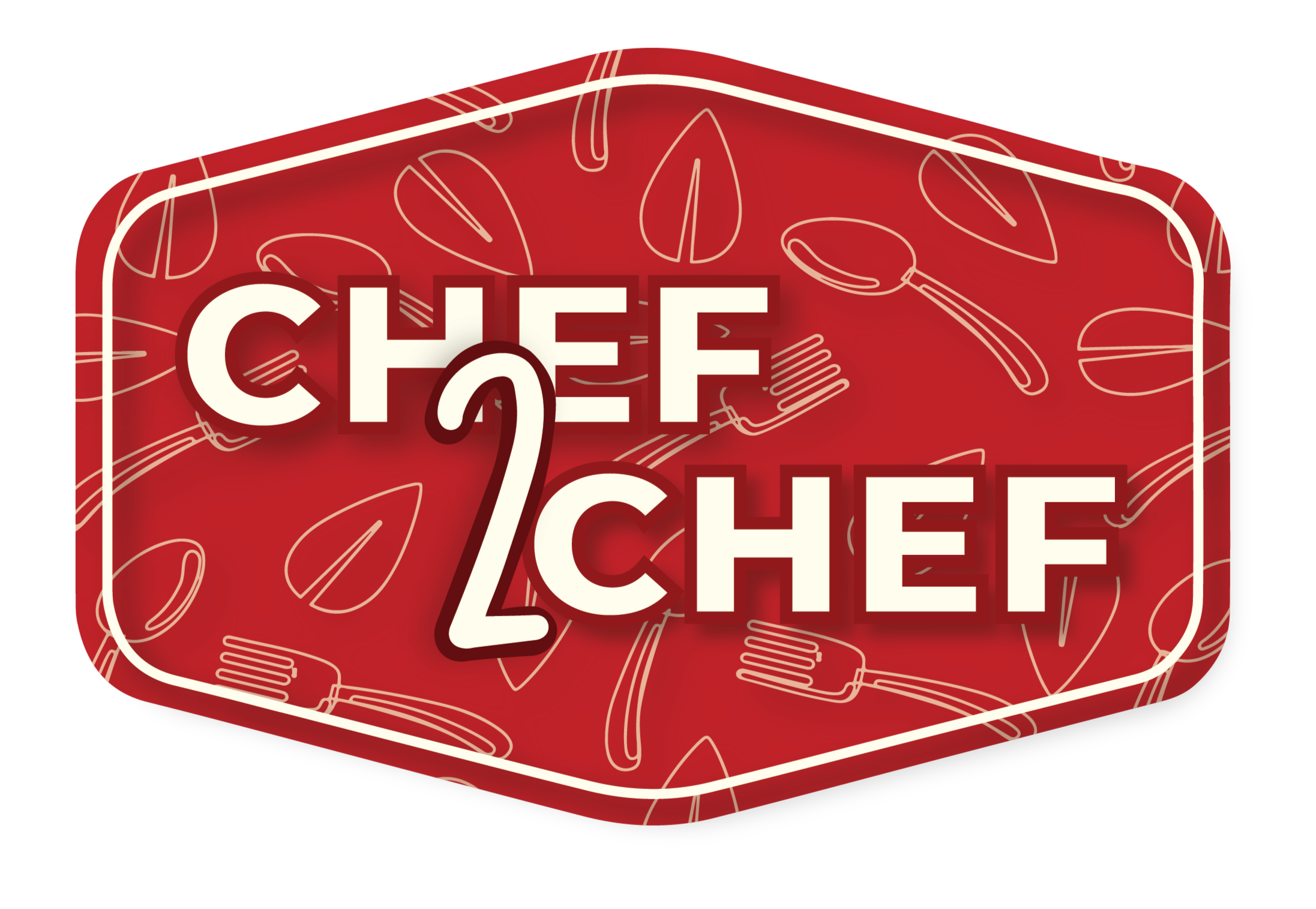
The Logo
The Chef2Chef logo was designed to be immediately recognizable and convey warmth, trust, and the essence of home-cooked food.
Packaging
Color Palette
Color Palette
Kitchen Harvest
Kitchen Harvest
#931A1E
#BF2227
#FEFBEC
#E7B398
Iconography
Typography
Iconography
Reflection
Chef2Chef was one of my earlier packaging projects, and it taught me to think about how a visual identity needs to work beyond a single piece of design. With different products, formats, and information to work with, I had to find ways of keeping the packaging recognisable while allowing each product to have its own presence. Creating the supporting icons and visual elements also made me more aware of how small details can help build consistency across a range. Looking back, it was a project that gave me a better understanding of packaging as part of a larger brand system, rather than just designing the front of a pack.