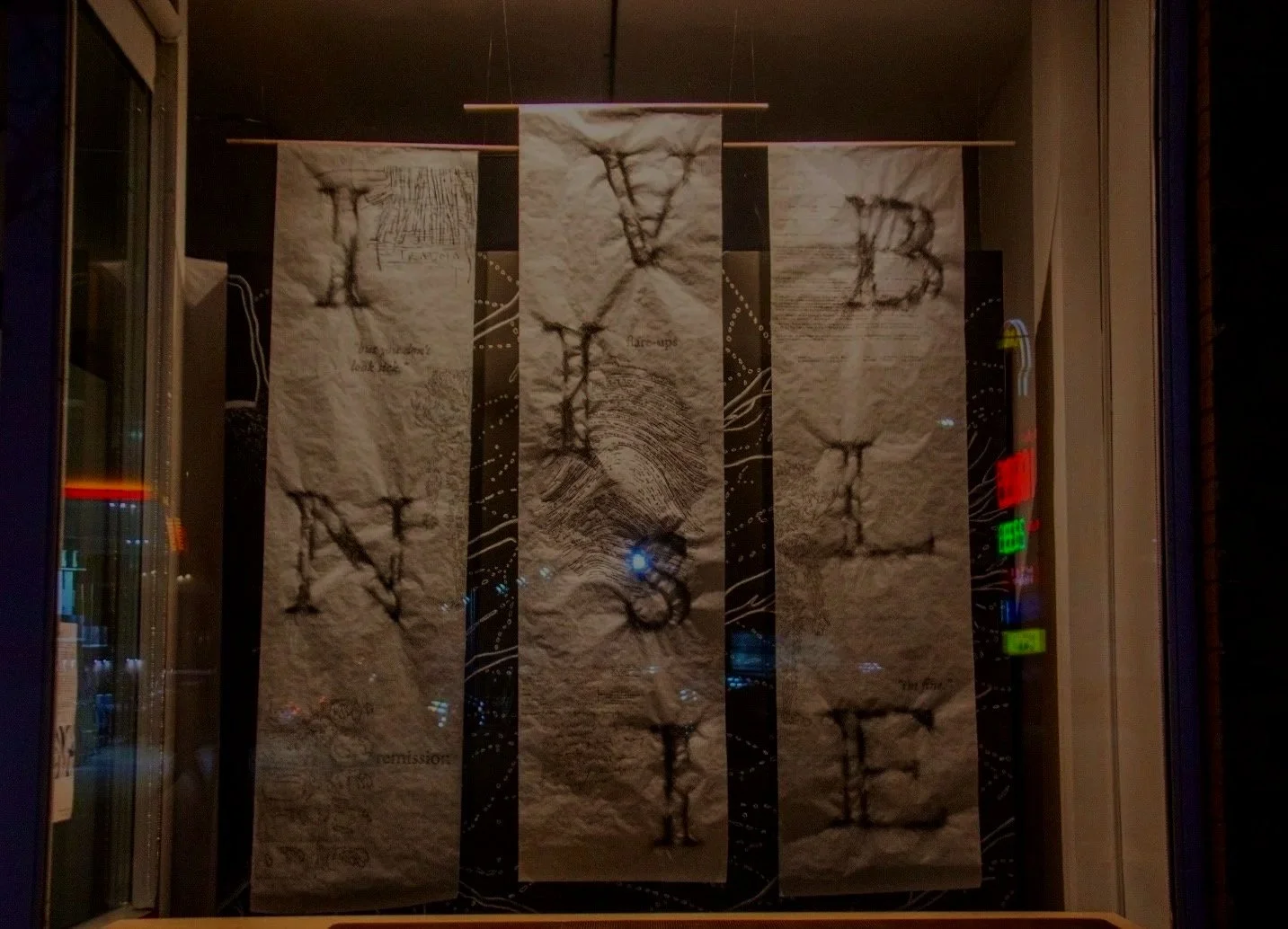
Invisible Ink
Invisible Ink investigates the potential of typography to act as a vessel for emotional expression and as a means of conveying the experiences of someone living with chronic autoimmune illness.
OCAD University
MDes Solo Exhibition and Thesis Project
assemblage gallery, 2015 Dundas St. W, Toronto
March 18-April 8, 2026
CHALLENGE
Medical language describes diseases, but often fails to communicate the fluctuating nature of autoimmune illness. Can typographic form articulate what language fails to convey?
CHALLENGE
Medical language describes diseases, but often fails to communicate the fluctuating nature of autoimmune illness. Can typographic form articulate what language fails to convey?
TIMELINE
8 months
APPROACH
Practise-Based Research, Autoethnography, Typological Analysis, Material and Analog Exploration, Letterform Design
APPROACH
Practice-Based Research, Autoethnography, Typological Analysis, Material and Analog Exploration, Letterform Design
DELIVERABLES
Letterform Design, Thesis Paper, Exhibition and Installation Design
DELIVERABLES
Letterform Design, Thesis Paper, Exhibition and Installation Design
The Problem
“But you don’t look sick…”
Autoimmune illness causes the body to destabilize in ways that are often invisible to others. As a result, the lived experience lies somewhere between being seen and being invisible, articulation and silence.
What does it mean to be visible? And how can design intervene where the world falls short?
Research Question
How can we use typographic form to articulate the internal, often non-verbal, experience of living in a body under attack by its own immune system?
Rather than illustrating illness or relying on clinical terminology, this research explores the possibilities for how the Roman Orthographic alphabet can function as a structure that carries and translates the bodily experience of remission and flare-ups within autoimmune conditions.
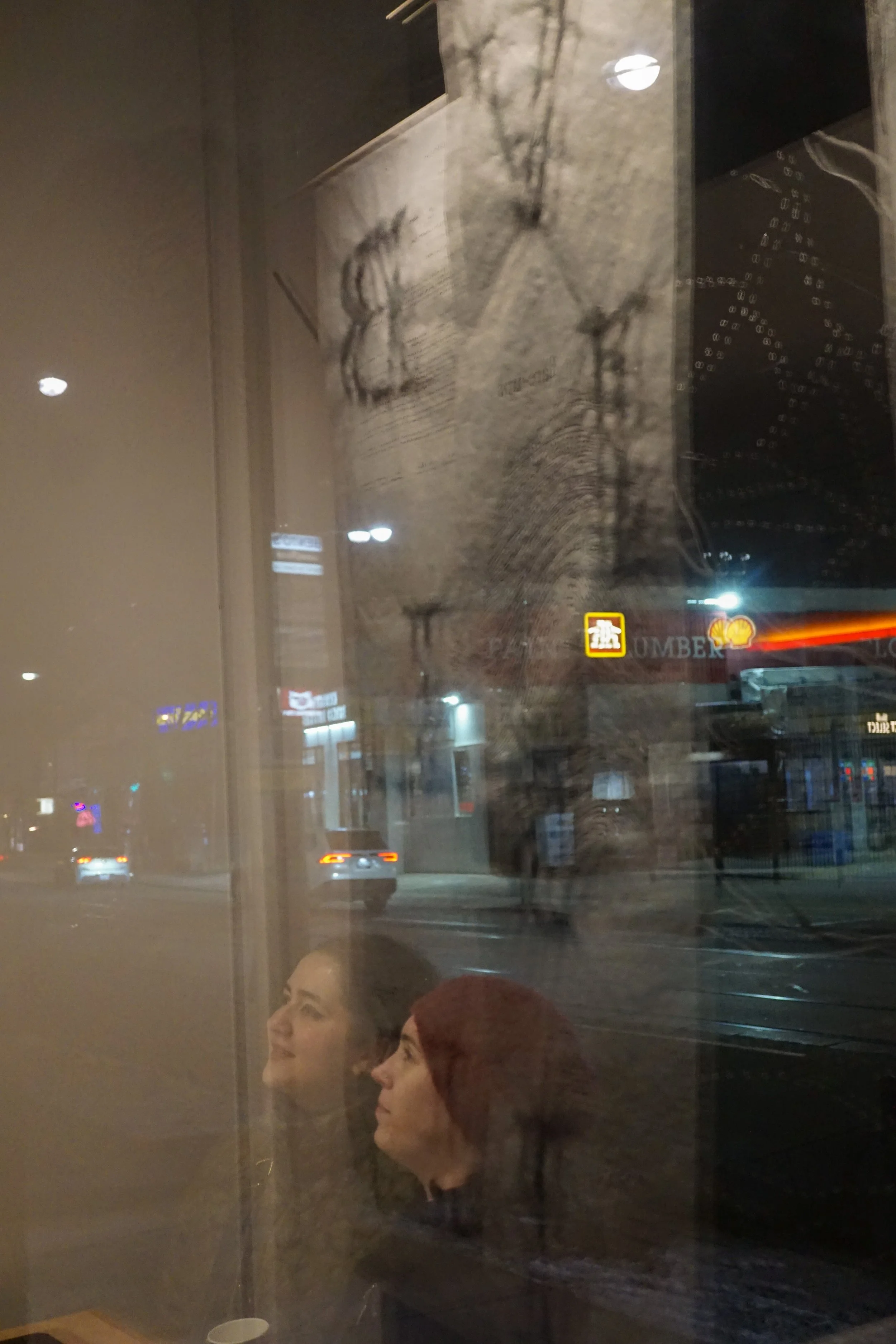
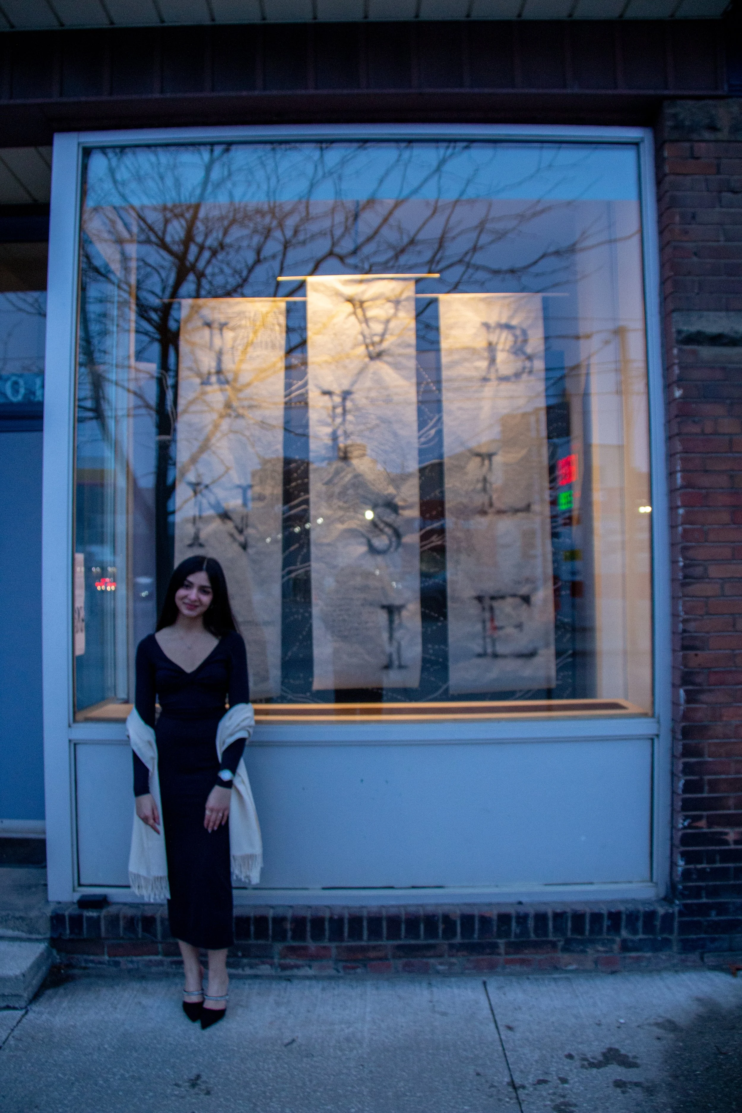
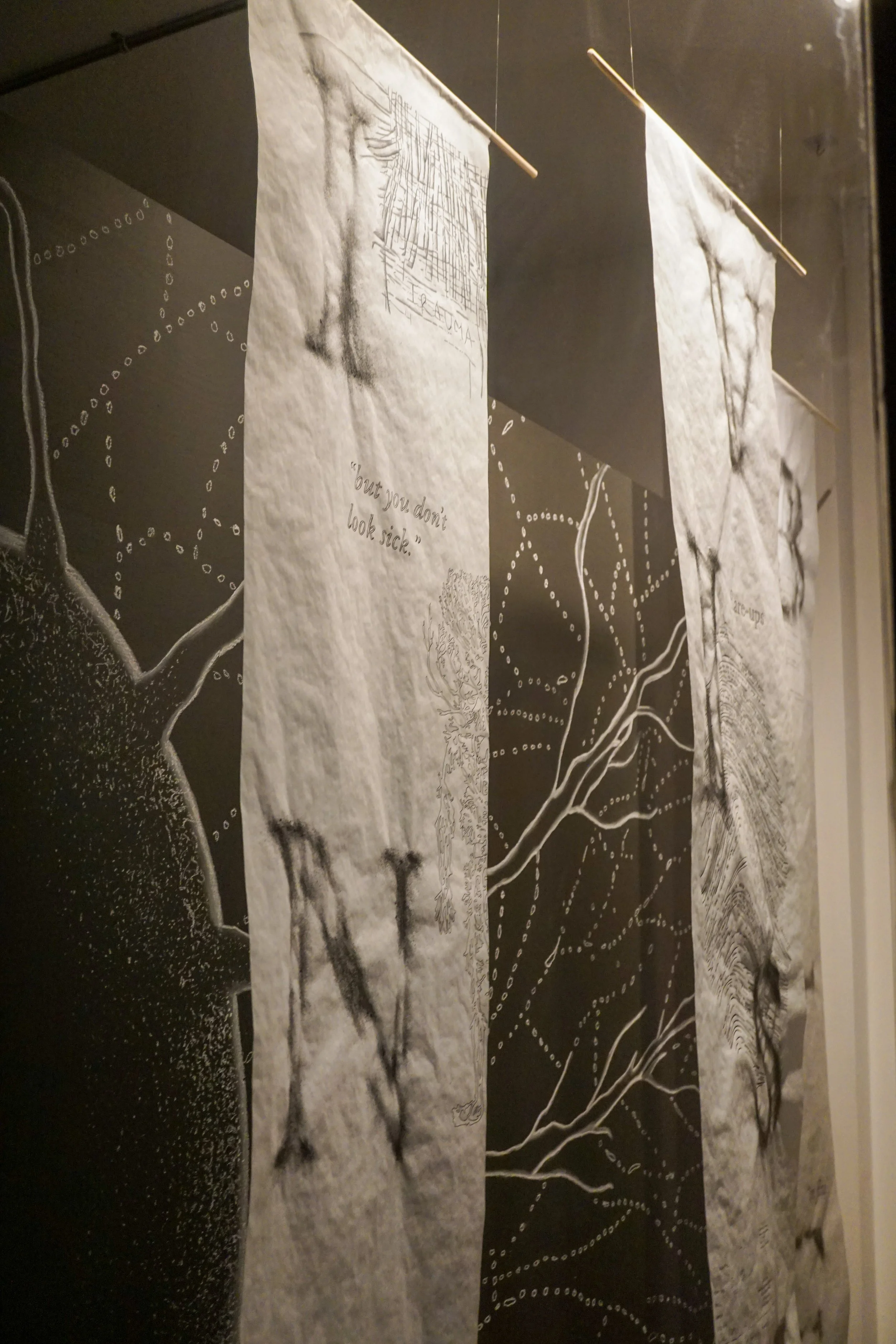
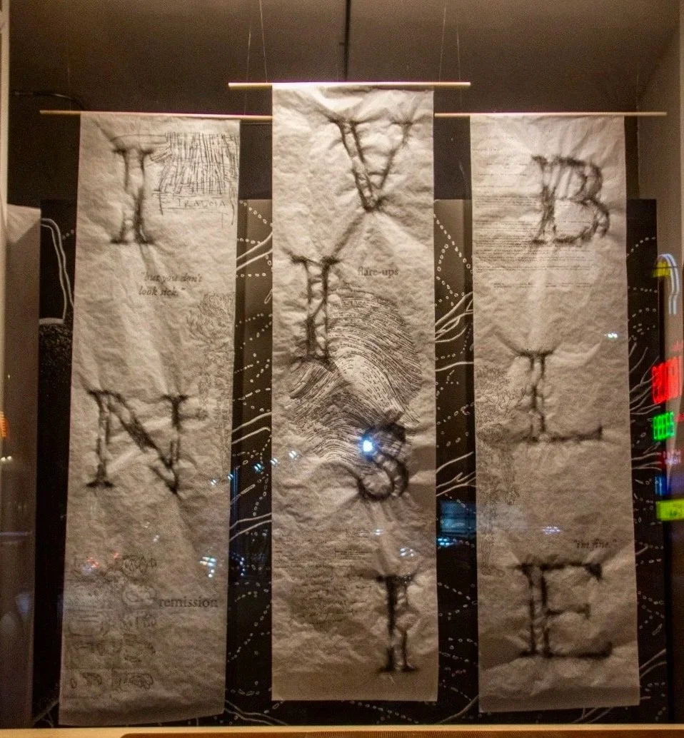
01
The Body
Designing Instability
Flare and remission became the central structural logic. Instead of creating a typeface that simply looked distressed, I wanted the letters to behave like a body that fluctuates between presence and absence.
02
The Skeleton
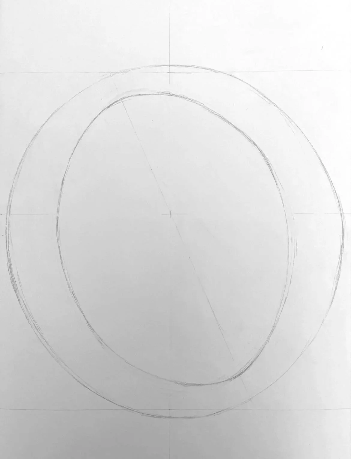
The underlying structure needed to remain stable, so I looked to Venetian typefaces for their humanist proportions, strong oblique axis, and connection to handwritten form. The skeleton became the constant; everything happening on its surface could then fluctuate.
The structure of the 'O', showcasing the diagonal axis
03
The Seed Glyph
The visual language began unexpectedly with the residue of tea leaves at the bottom of a cup. Their clustering and dispersal echoed the stippled textures I had been experimenting with, becoming the basis for the seed glyph: O.
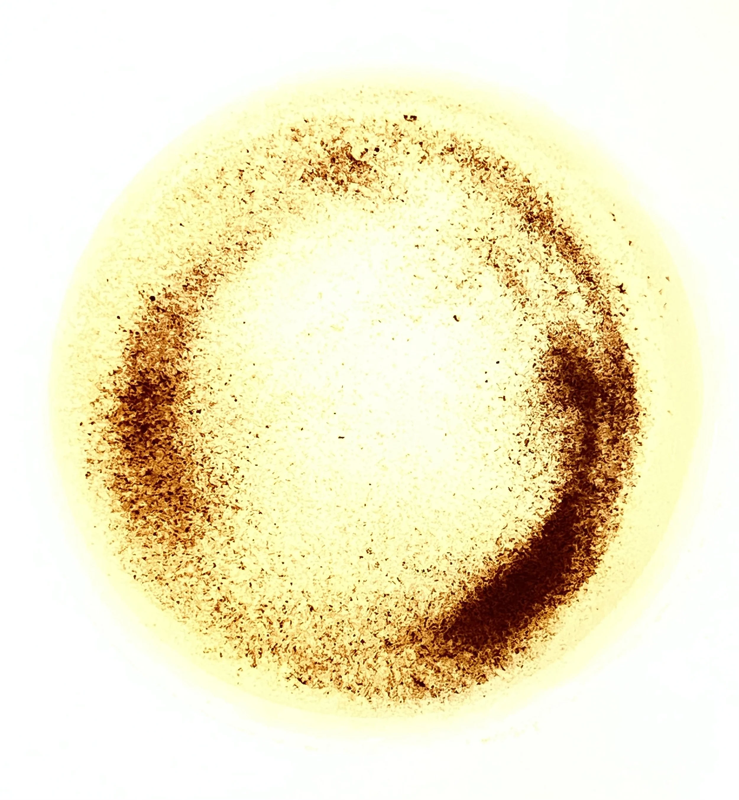
The residue of the tea leaves at the bottom of a cup
04
Flare & Remission
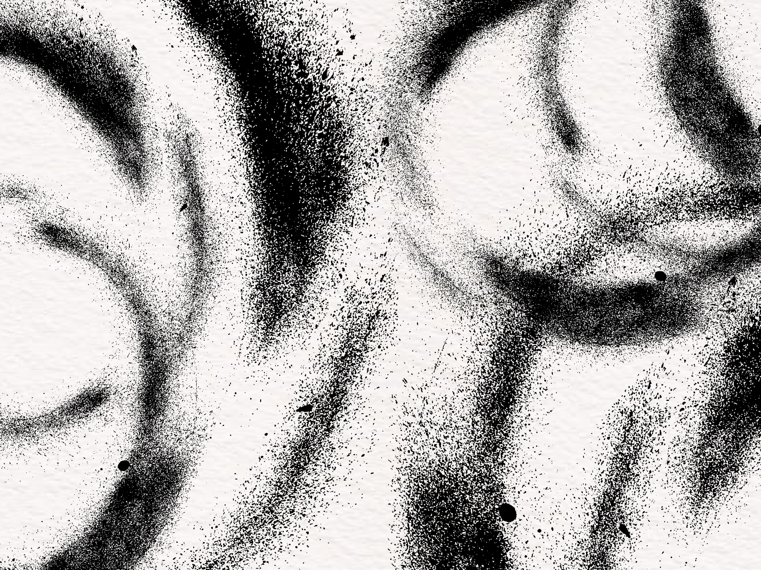
The parts of each letter that are absent — where the form dissolves, disperses or fails to fully materialize, represent remission: the illness that is present but unseen. The parts that are dense with texture and dark with sprayed pigment, represent flare: the illness asserting itself and making itself felt.
Every letterform holds both states simultaneously.
The skeleton remains. The surface shifts.
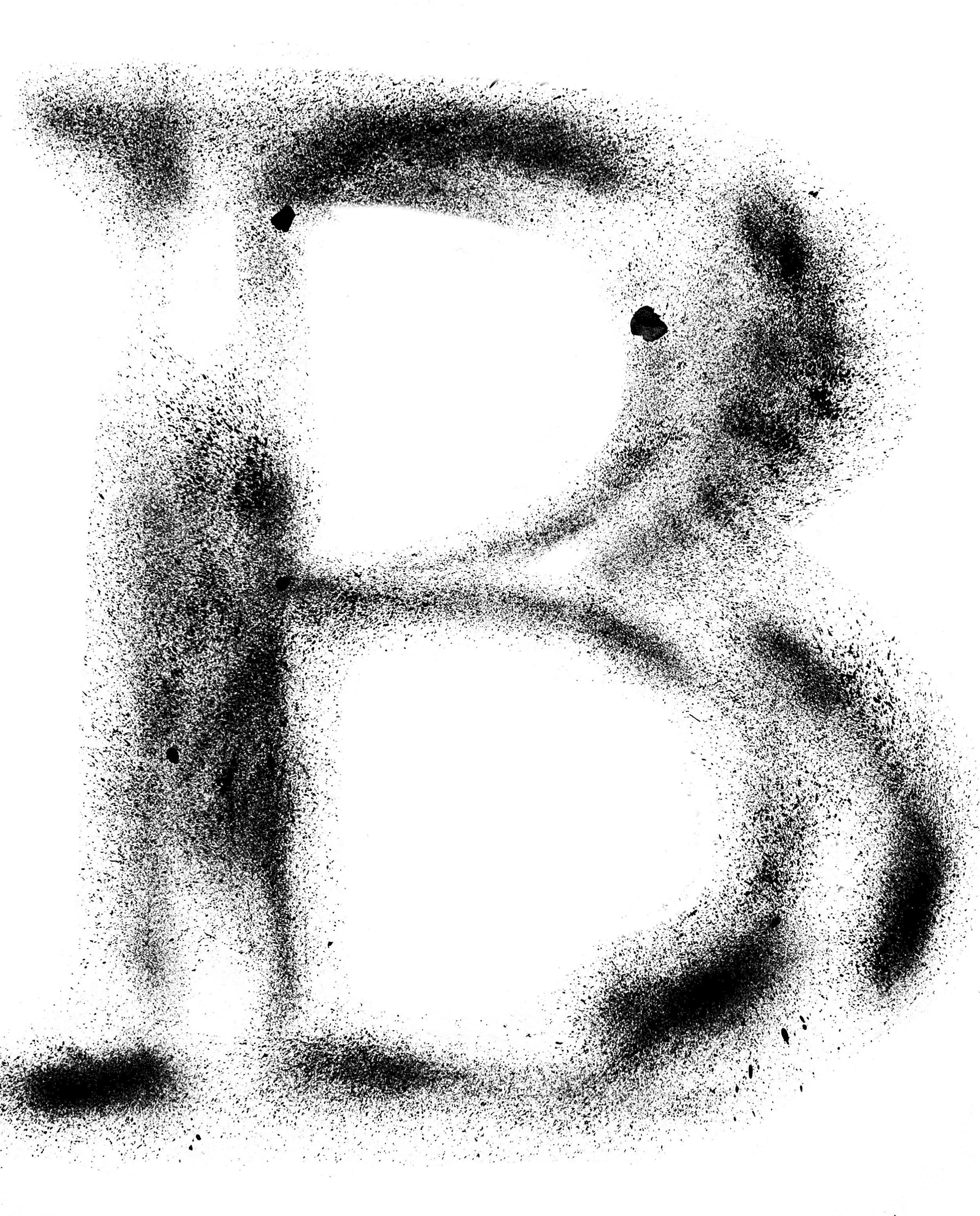
The letter ‘B’ showing both flare and remission
05
From Material to Pixel
Each letter was made physically, then scanned and translated into bitmap form. I chose pixels rather than vectors because vectorisation would smooth out the irregular edges and restore the stability the project was deliberately resisting. The bitmap preserves the grain, softness and uneven distribution of the original mark.
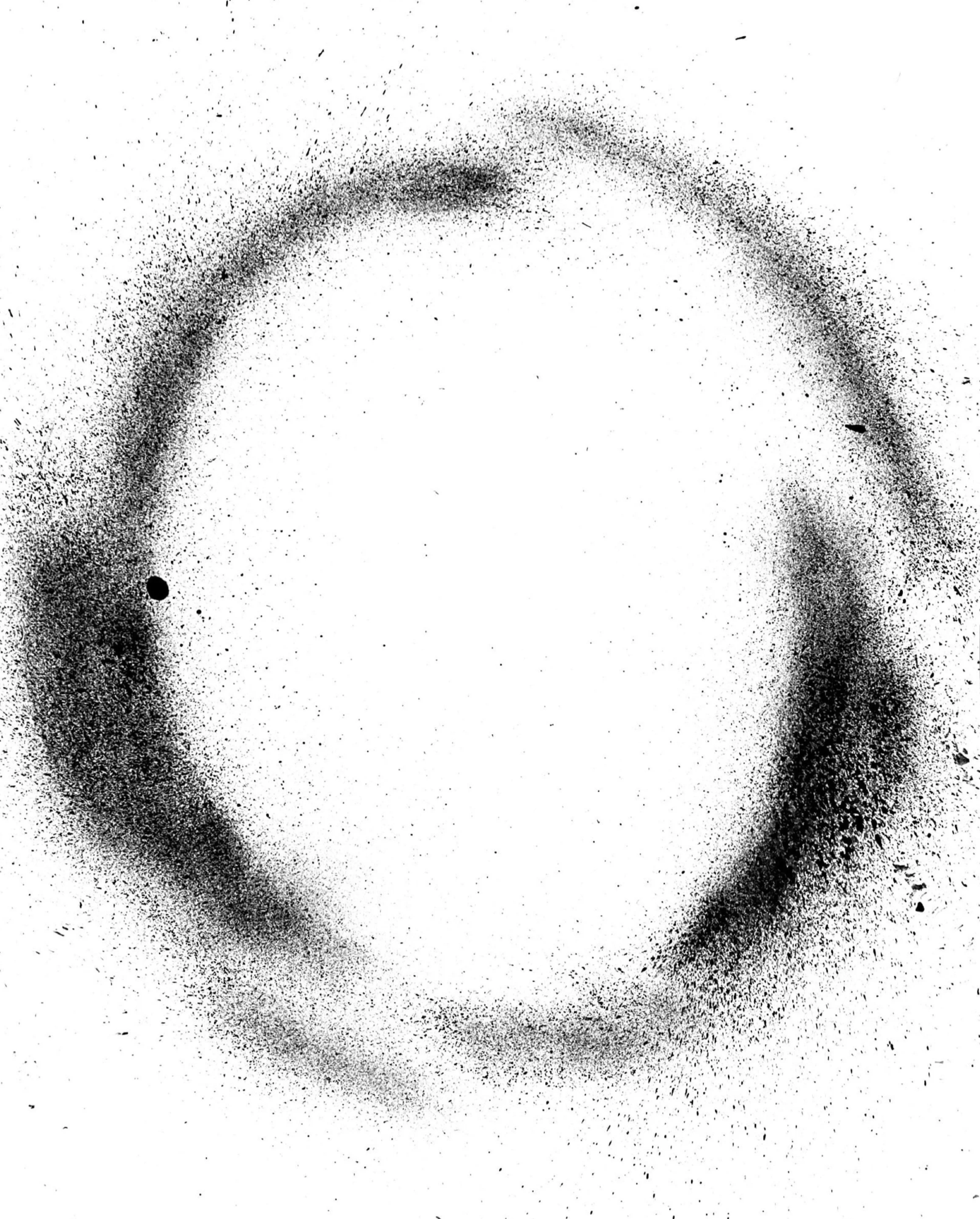

The seed glyph 'O', made physically by replicating the texture and position of the tea leaves, while following the structure of Venetian typefaces
The 'O' converted into a bitmap format
Formal Decisions about the Letterforms
The Serif
In expressive typography, serif are often abandoned to provide a cleaner, more geometric form. But the serif here is the part of the letter most connected to human touch. In a typeface about a body that is there but not fully visible, the serif confirms its presence.
Diagonal Axis
A recurring diagonal axis became a structural principle, introducing movement and imbalance. The tilt suggests a structure that is upright, but never entirely steady.
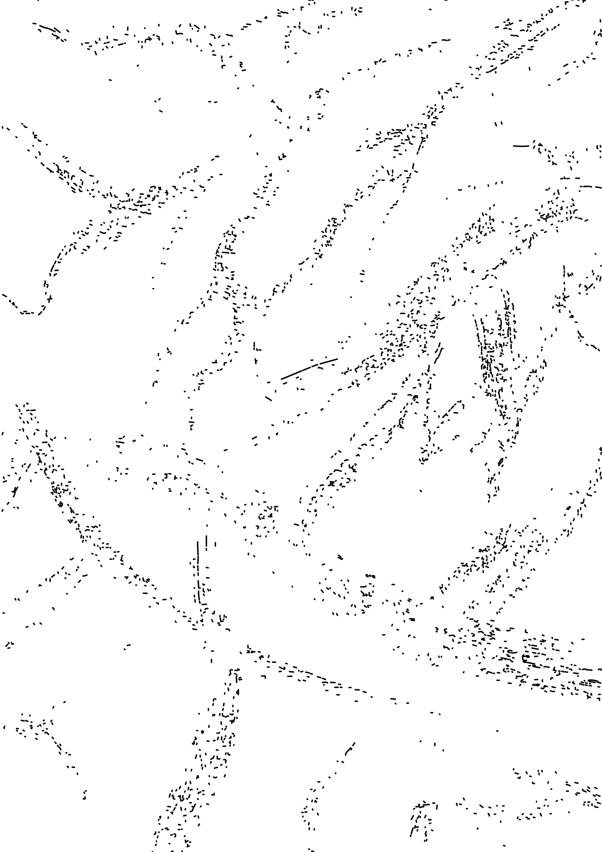
The diagonal axis I found in my work
Venetian Structure
The letterforms draw from Venetian typefaces, but destabilize their traditional structure through textural interruption, irregular weight and controlled erosion, pushing the classification towards conceptual and expressive type.
Granular Texture
The soft, granular texture creates the feeling of an impression rather than a mark — suggesting that a surface has been affected, even when the source is no longer visible.
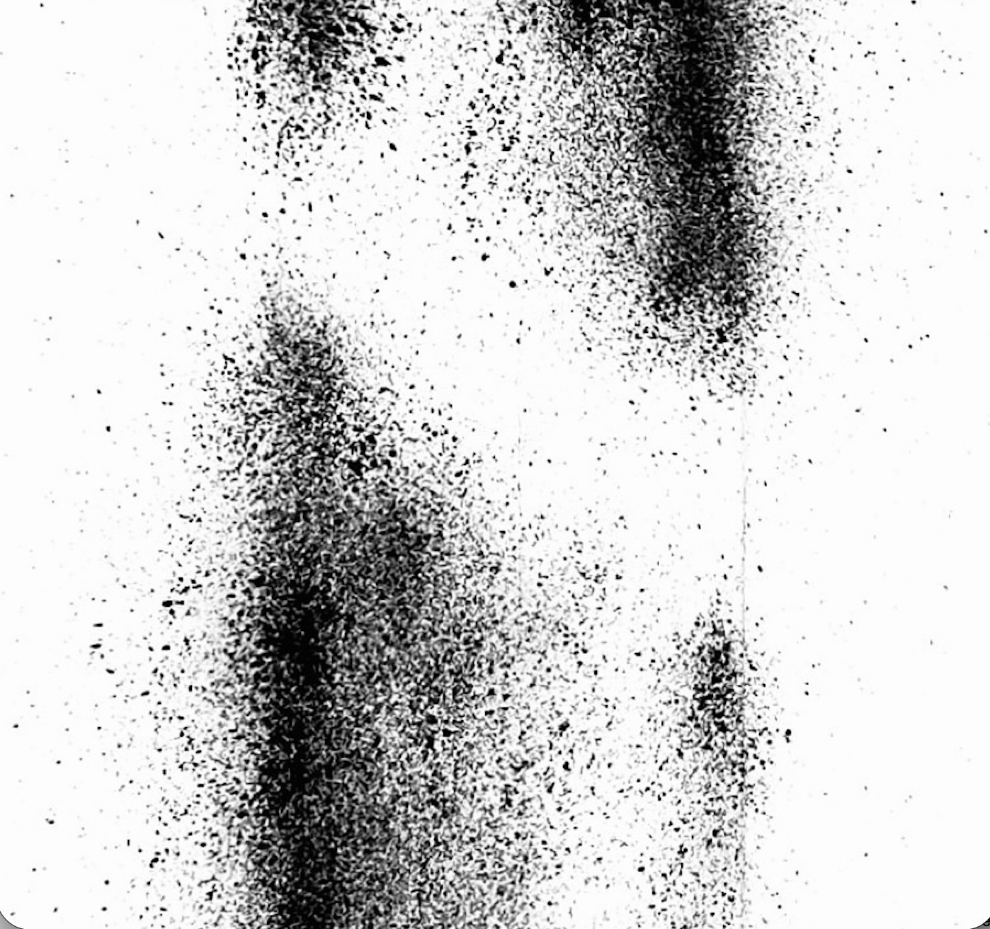
A close-up of the soft, granular texture of the 'I'
Physical Process
Each letter required repeated rounds of spraying, flicking pigment across the paper with my wrist and thumb. The process itself became an act of physical pressure, mirroring the experience the letters were made to express.
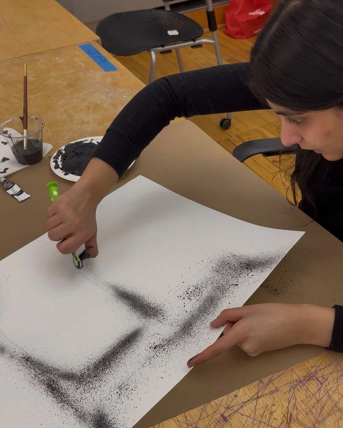
The physical act of making the letterforms
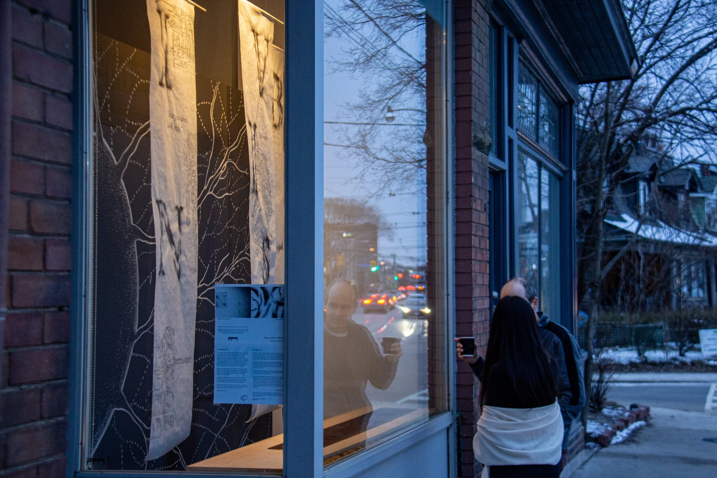
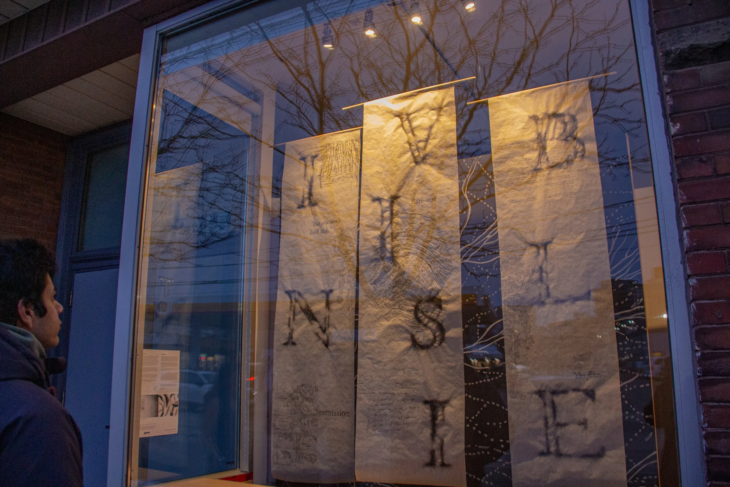
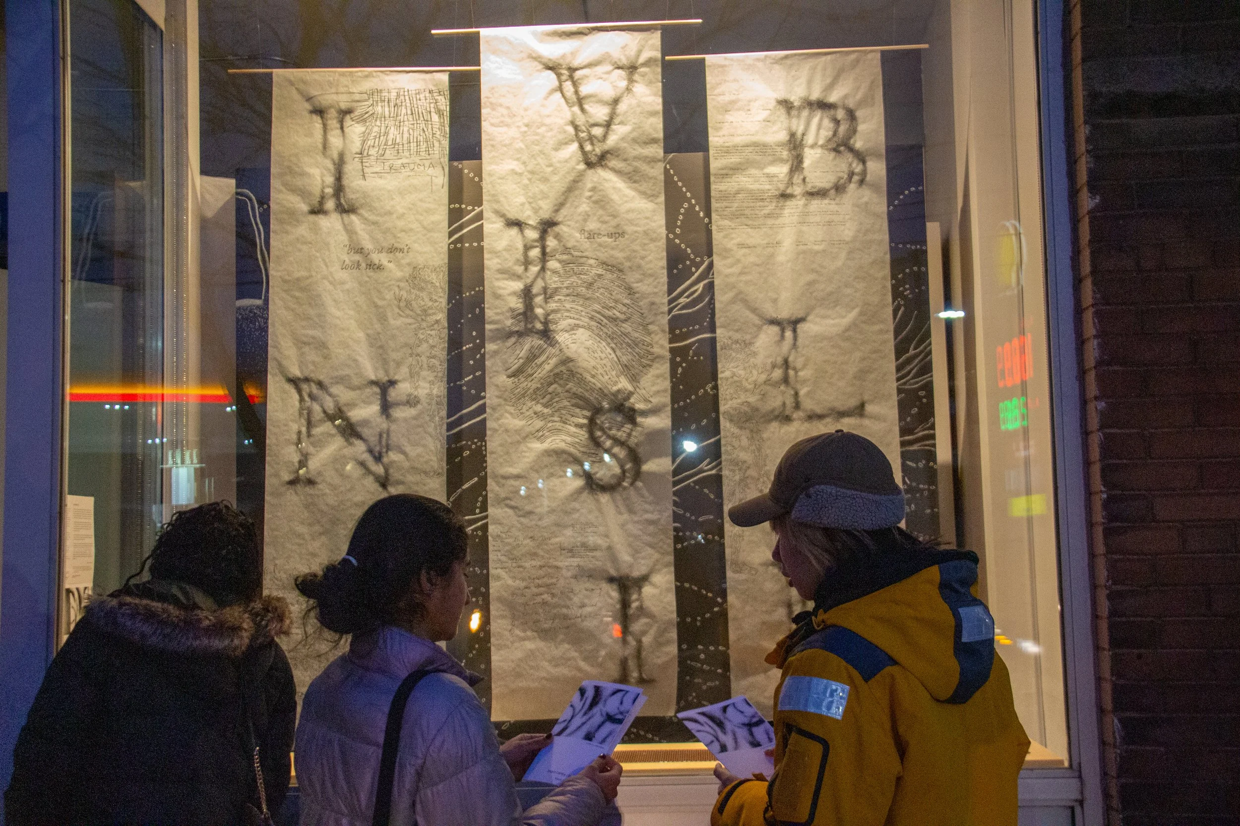
The Exhibition
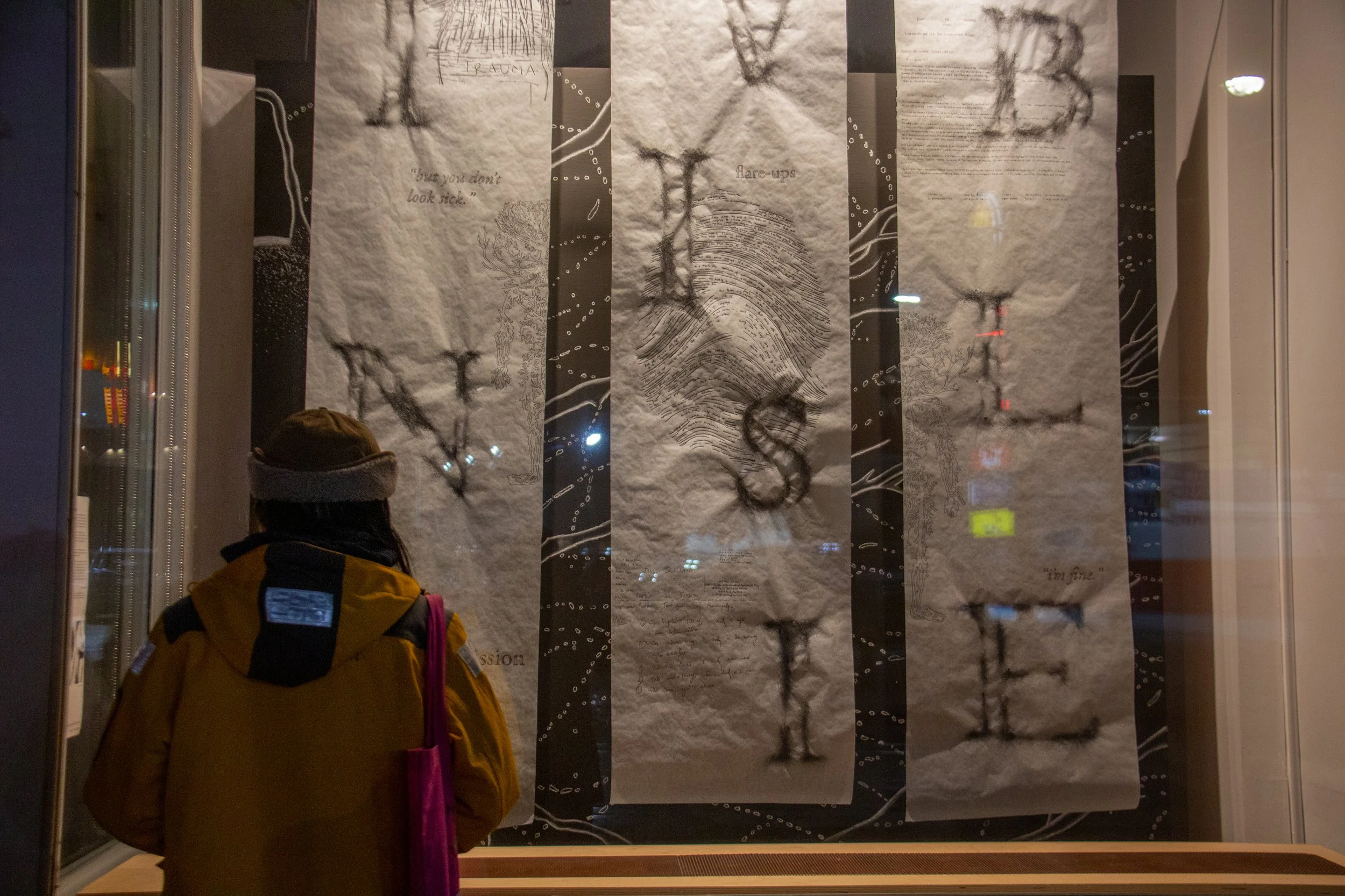
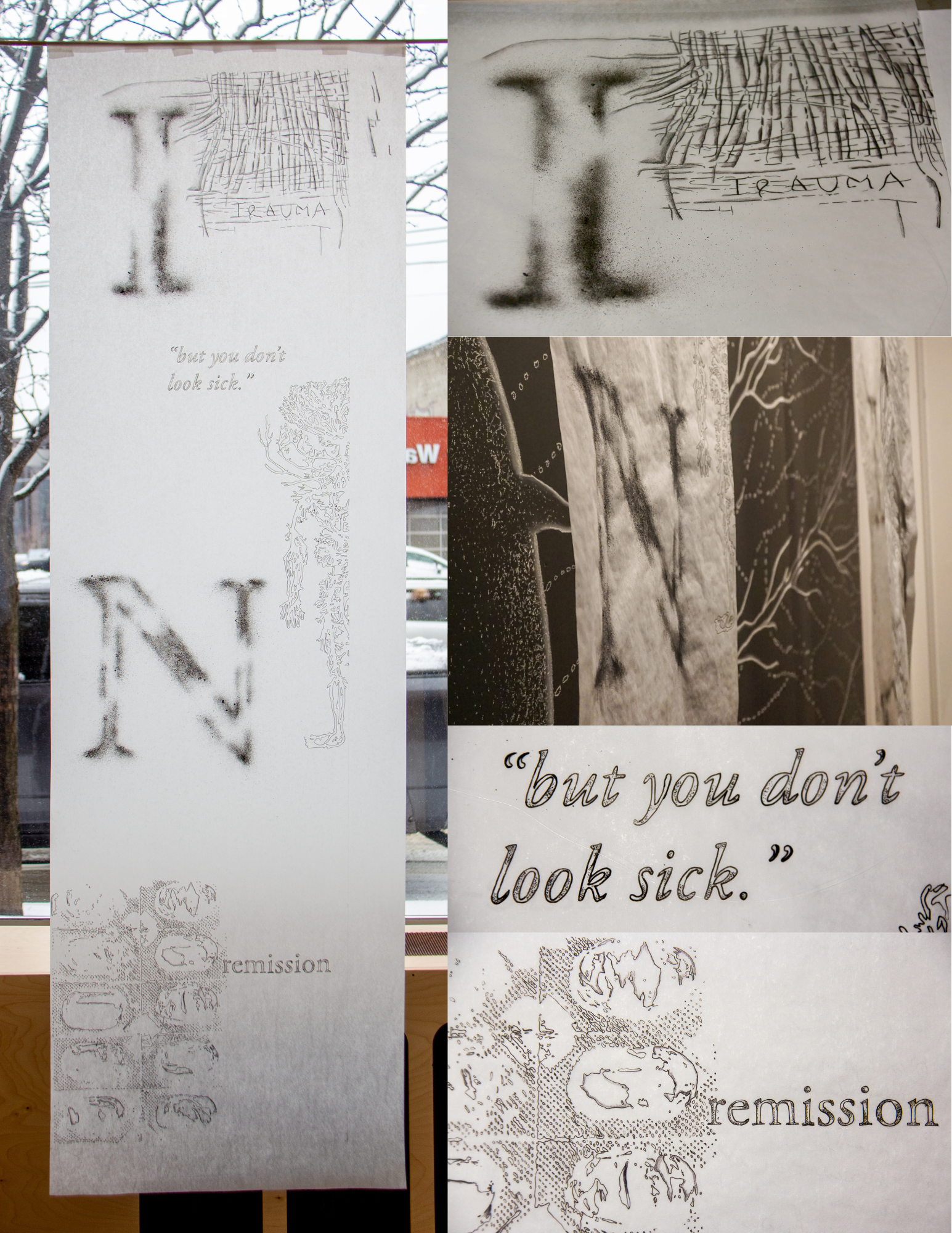
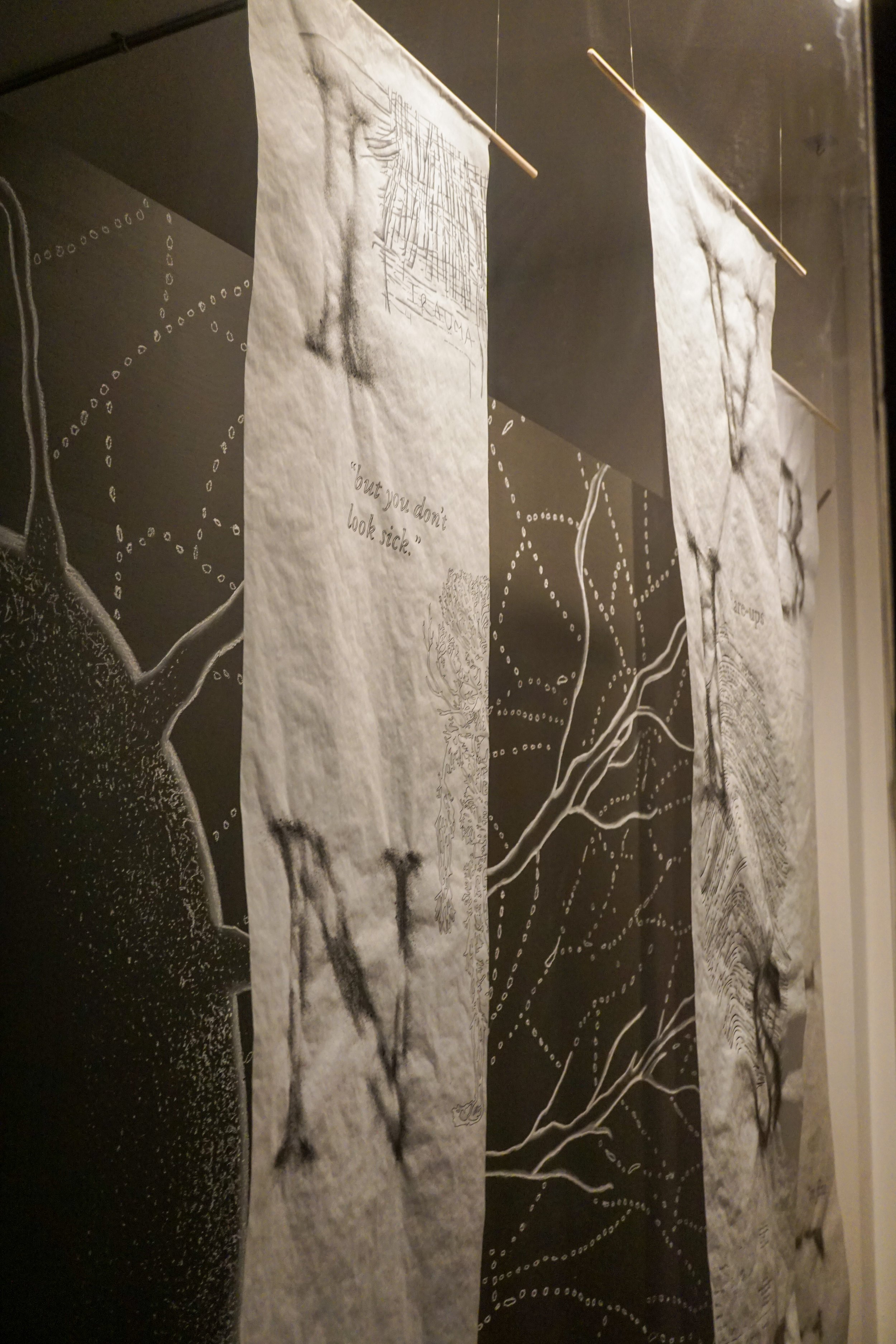
The First Panel
The first panel — carrying the letters I, N, and the opening of the word INVISIBLE — holds the physical dimension of illness.
The word TRAUMA, written in lines of medical gauze that intertwine to form the letters: the substance of wound care used to spell the wound itself.
The phrase “but you don’t look sick”, the sentence most directed at people with autoimmune illness, functioning as reassurance but also erasure.
Below it, the half of the arterial system of the human body, representing a body rendered incomplete.
At the bottom, the empty shells of medicine blister packs are drawn: the evidence of their absence, recording a body that has been medicated repeatedly.
And lastly, the word “remission”, echoing the logic embedded in the letterforms themselves.
The Second Panel
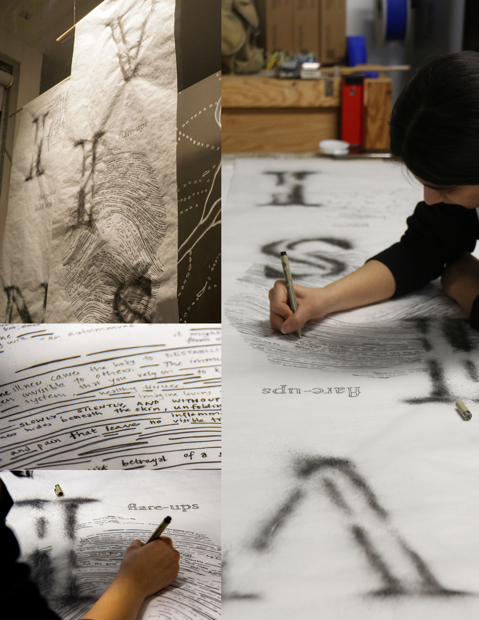
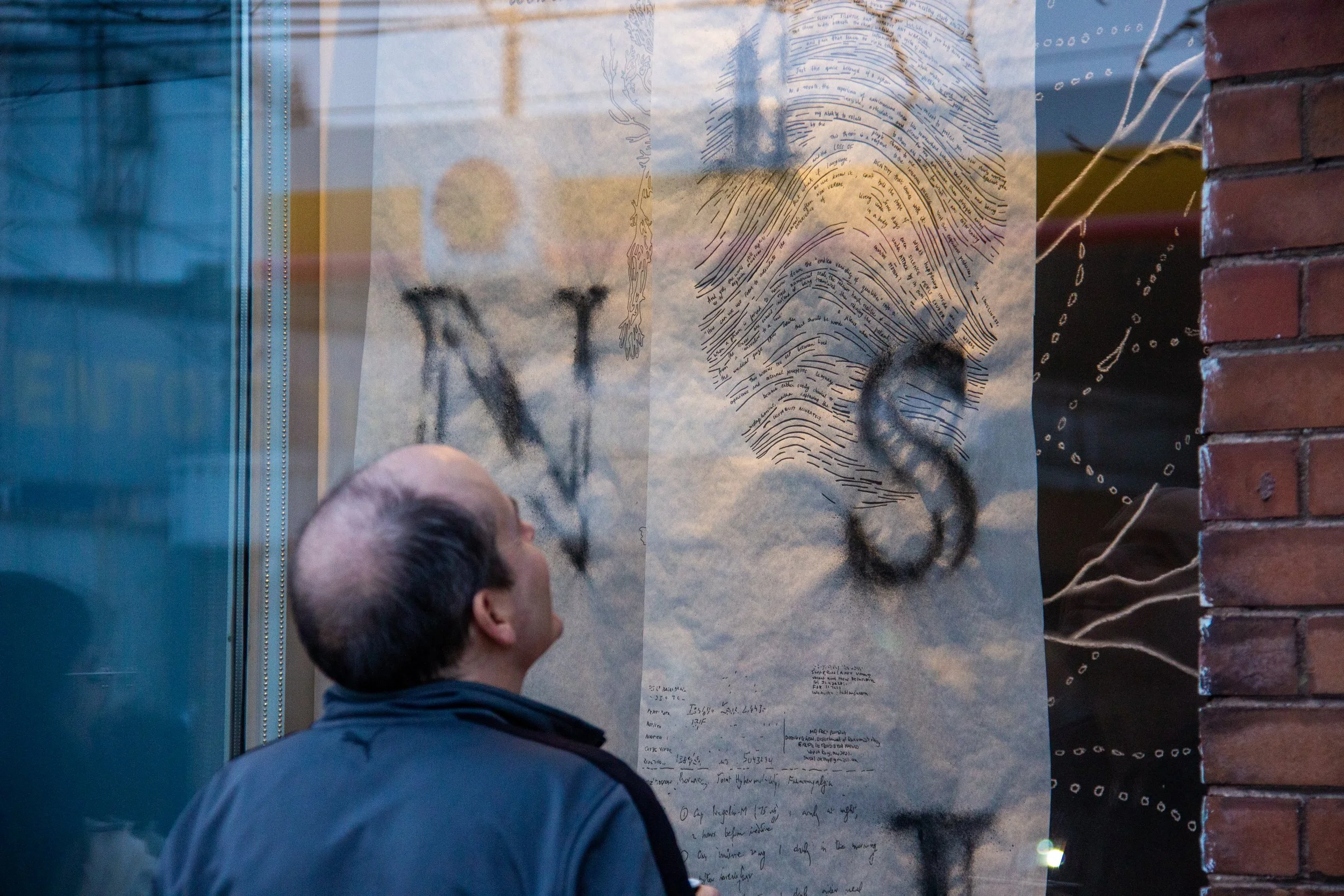
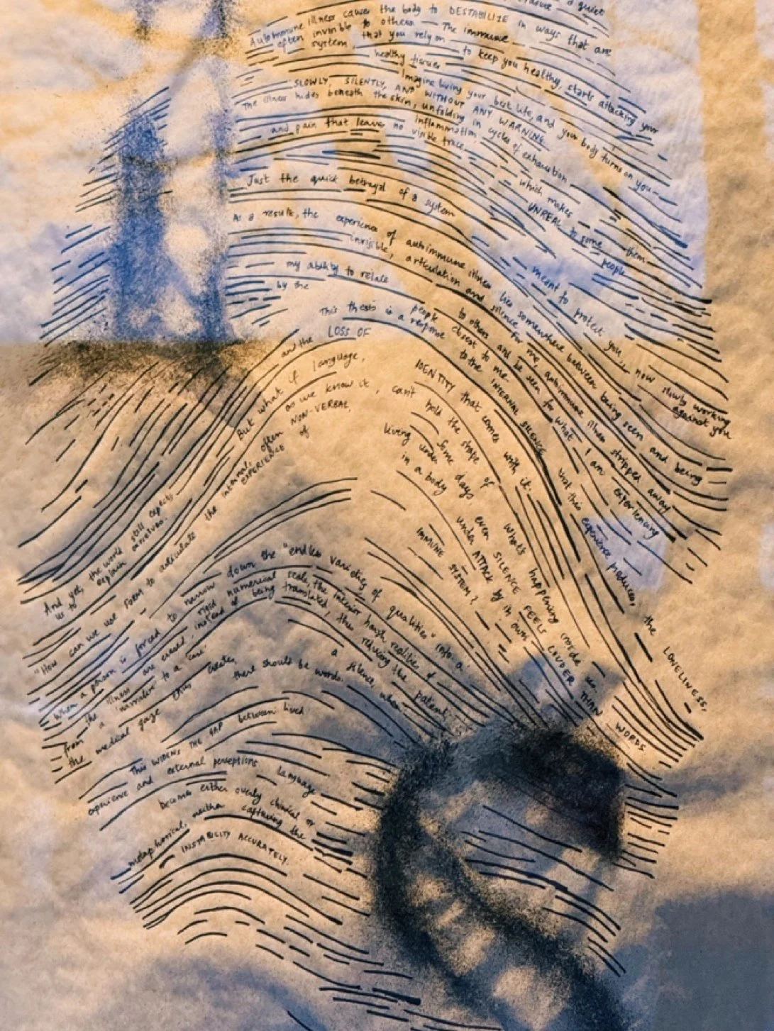
The second panel — carrying the letters V, I, S, I — holds the psychological dimension: the interior experience of illness, that doesn’t always have a visible marker.
A large fingerprint dominates the centre of this panel, standing for the loss of identity that comes with autoimmune illness. Journal fragments and thesis writing are embedded throughout the layers of the fingerprint, some words and ridges missing.
The word “flareups” is written to show it as a lived reality.
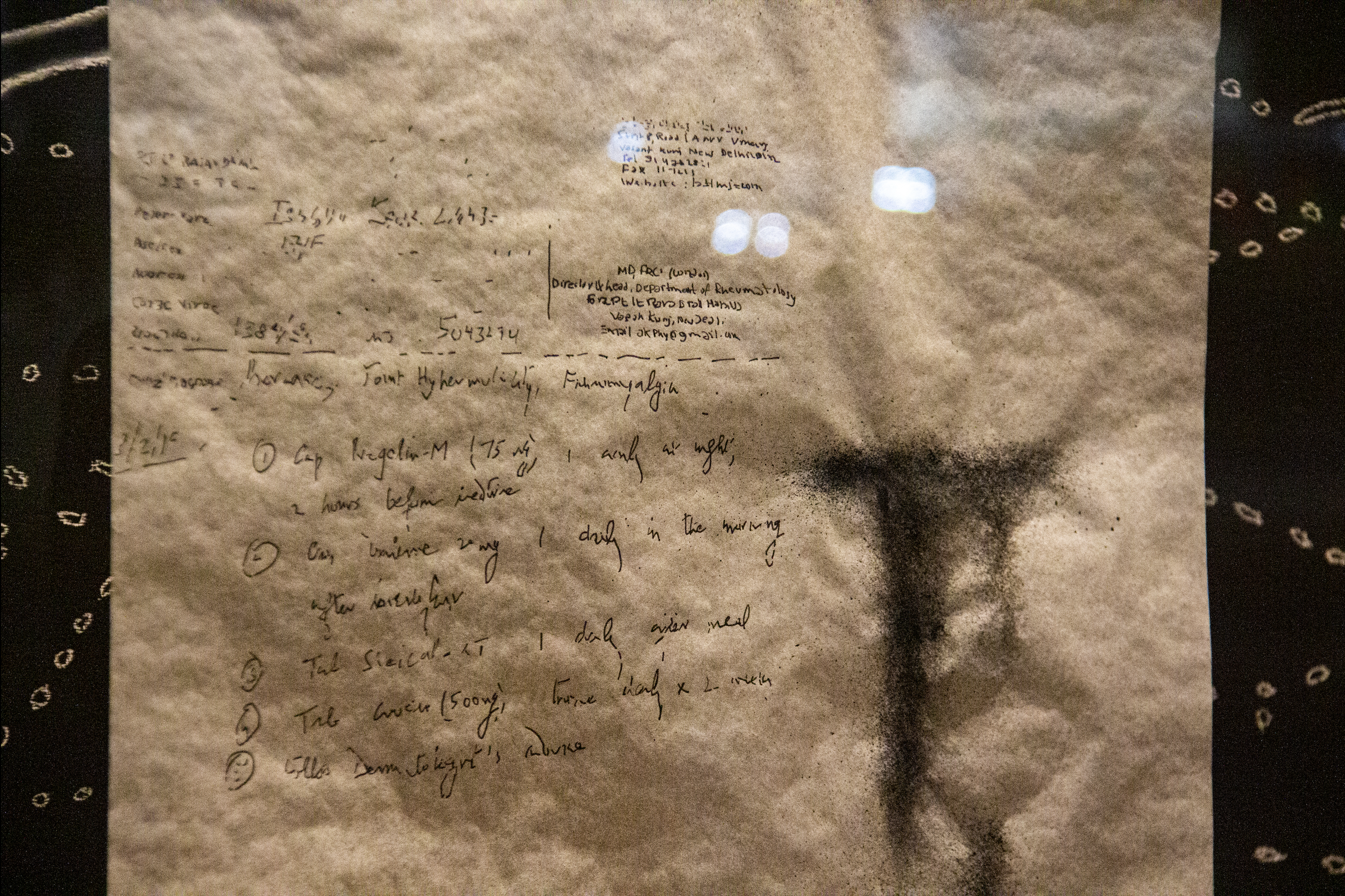
The actual medical prescription of my first diagnosis is placed at the bottom, almost illegible, except the UHID (Unique Health Identification) number assigned to the patient.
This is precisely the point: the medical reduces the body to mere numbers and data points, instead of revealing what living inside such a body feels like.
The Third Panel
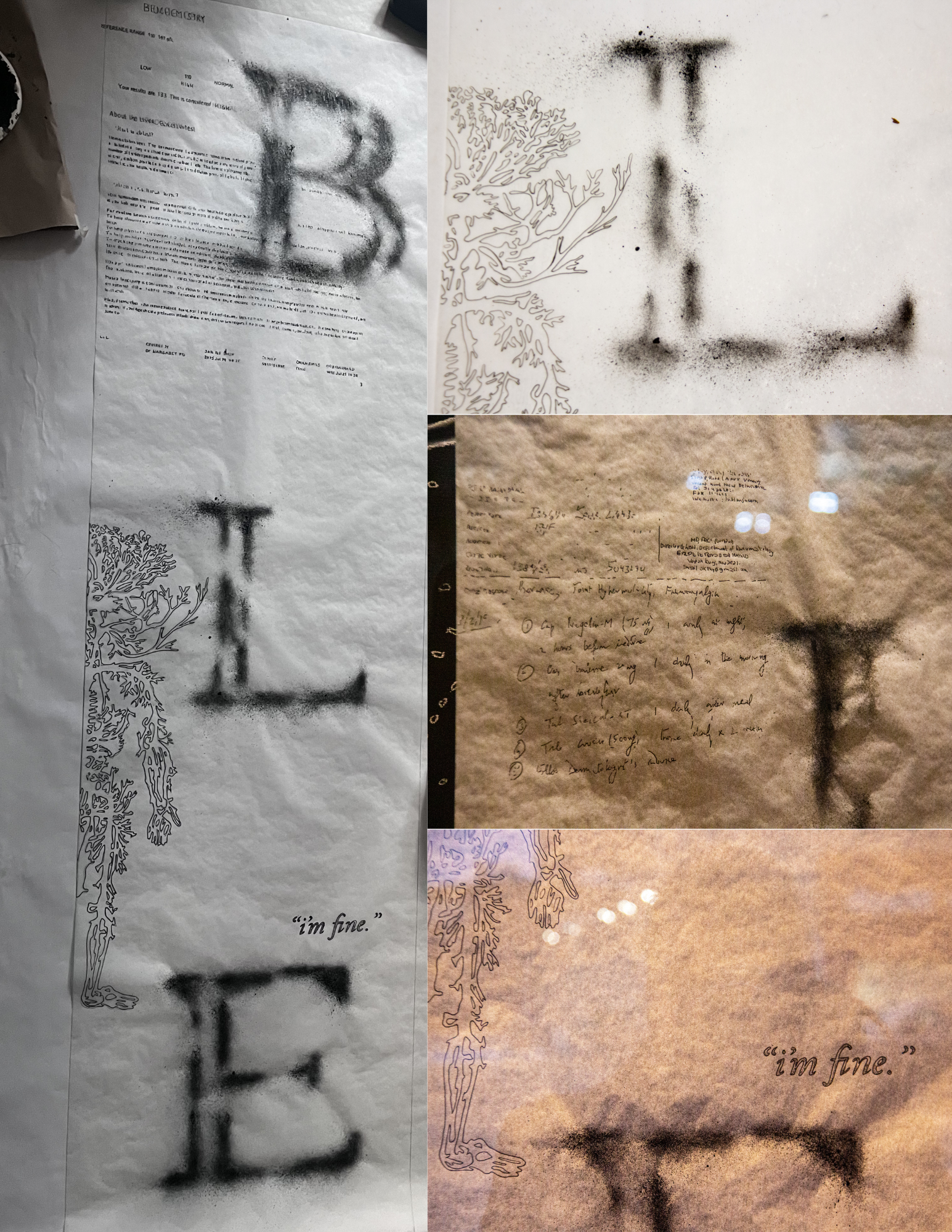
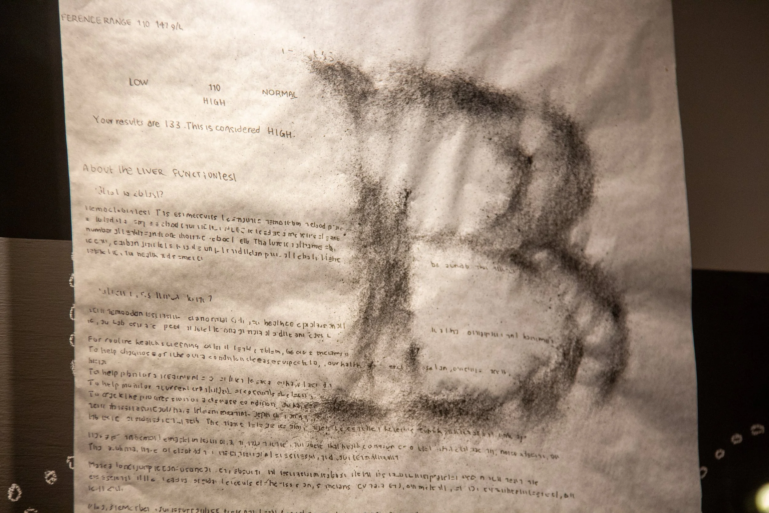
The third panel — carries the letters B, L, E, and closes the word INVISIBLE. It holds the dimension of what chronic illness does to your sense of self over time.
Blood test results, including flagged abnormalities, are rendered nearly illegible at the scale of the installation. Medical data attempts to quantify the body, but often fails to capture the experience within it. The information is all there, yet becomes noise.
The second half of the arterial system completes here what the first panel began, and the body is made whole only when all three panels are read together.
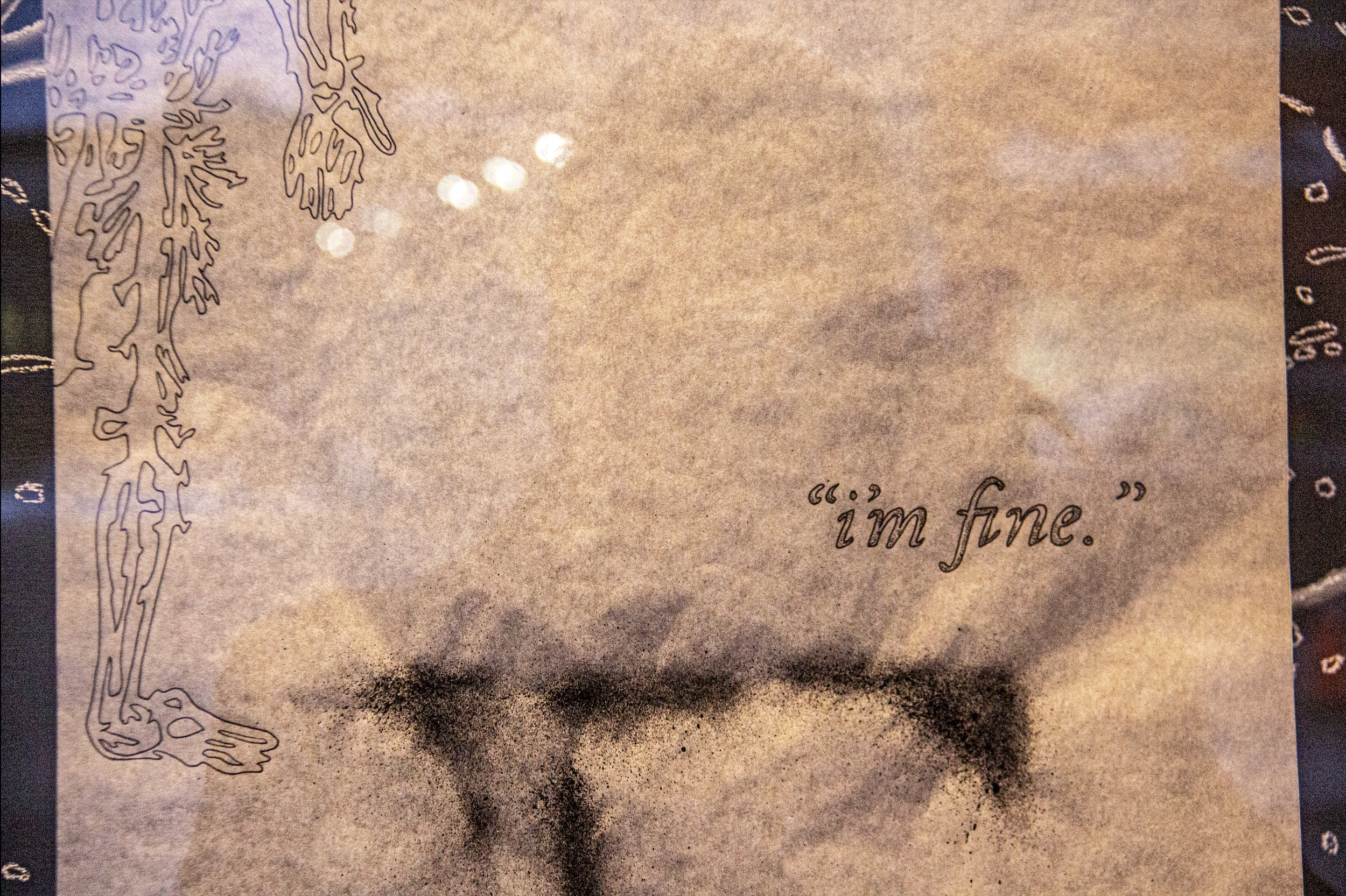
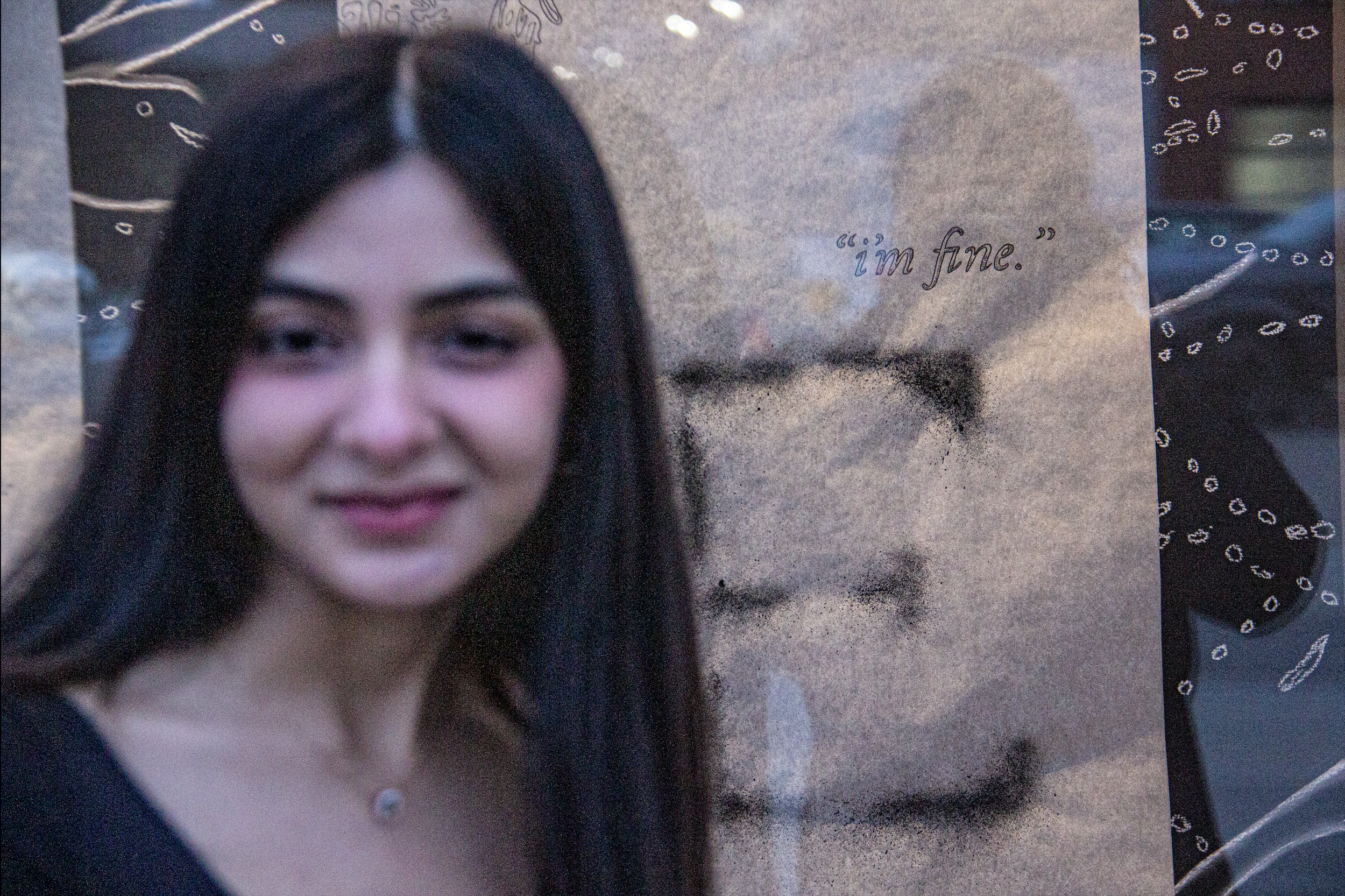
“I’m fine” is embedded into the panel as a phrase I learned to use as armour. It required no explanation, invited no pity, and became easier to say than the truth: that I wasn’t fine.
The Backdrop Wall
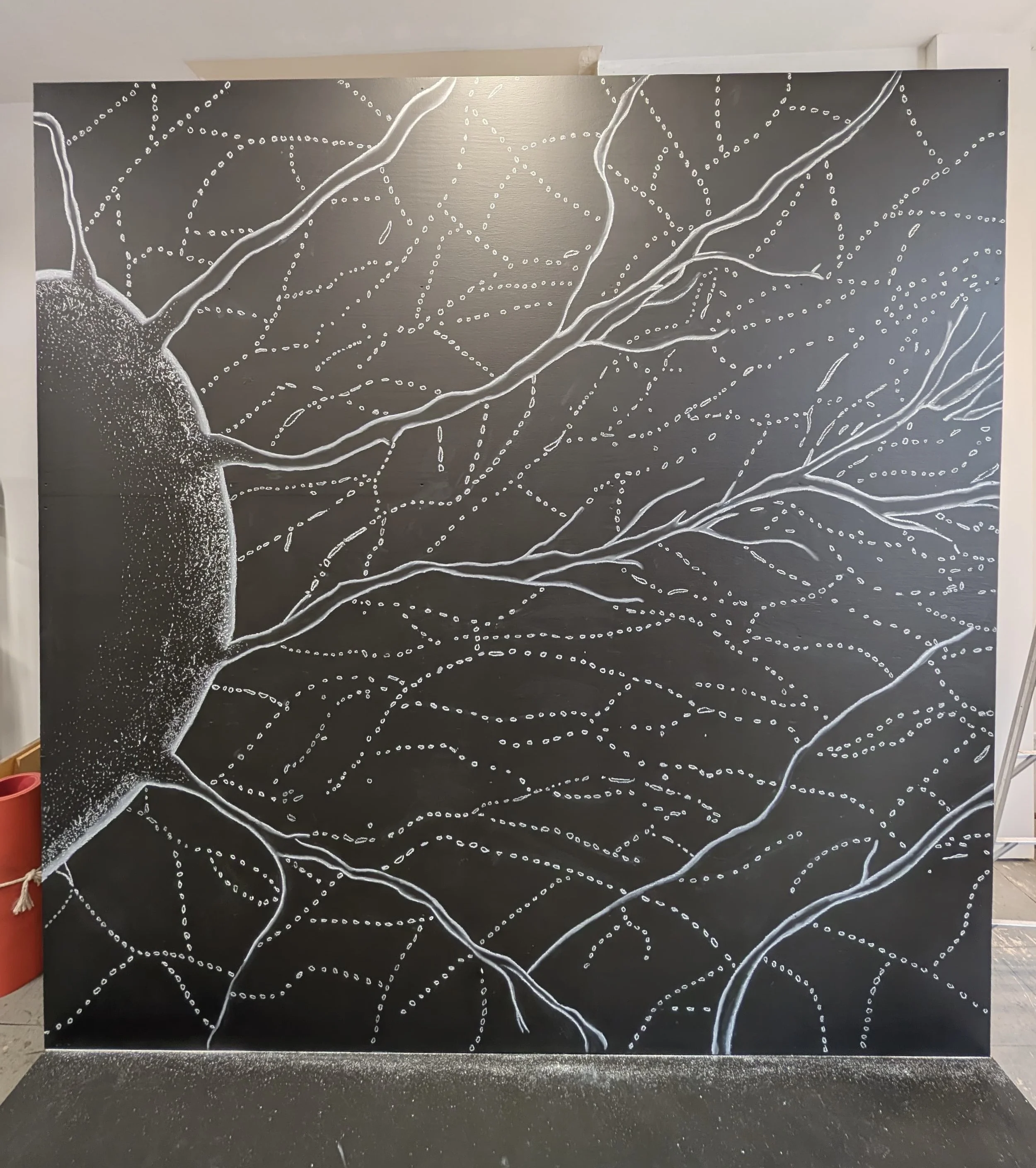
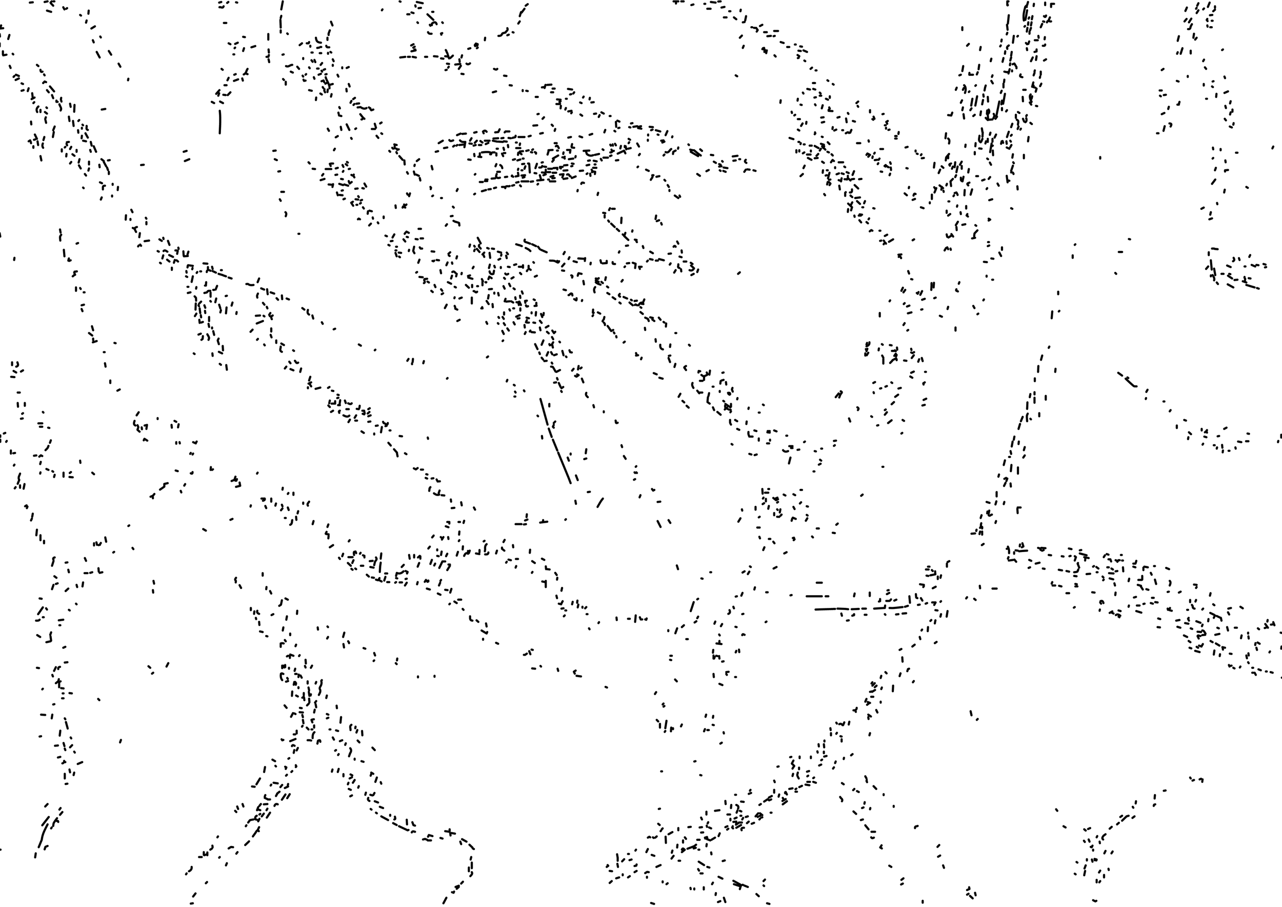
The backdrop wall was a large-scale drawing of dendritic cells, rendered in soft pastels. This choice was not primarily biological, but visual and intuitive.
The dotted structures, showed the weakening of a system that is present, but not whole. Whether or not the viewer knew what they were looking at biologically, it still conveyed a structure under pressure in a network that is expansive but fragile.
The dust that settled at the bottom after completing the piece with soft pastels added an additional layer, subtly replicating the texture of the letters.
Contribution to Design Knowledge
A New Typographic Framework
This project demonstrates that letterforms can communicate the internal experience of autoimmune illness through its formal properties.
A Replicable Methodology
By combining autoethnographic and practice- based research, the work established that lived experience and the design process itself function as instruments of enquiry. This framework is transferable to any design research project where the designer’s own experiences are the subject of investigation.
It responds to the communicative gap that clinical language, awareness design and conventional type have consistently failed to articulate.
A New Visual Language
It also proves that design can produce empathy and forms can make visible what words cannot hold.
Future Directions
Expanding the Letterforms into a Full System
So far, I have developed a limited set of letterforms to test the idea of instability within structure. I want to see how meaning will be translated with complex construction of words, numbers and punctuations, even sentences.
Exploring Digital and Interactive Forms
This work is currently materially grounded, but it could extend into the digital environment where instability becomes dynamic. For example, letters could shift form in real time, responding to the interaction and data that the user inputs.
Applying this Framework to Other Disciplines
While this project focuses on autoimmune illness, the framework is adaptable to other experiences that are difficult to articulate, for example, mental health or sensory conditions.