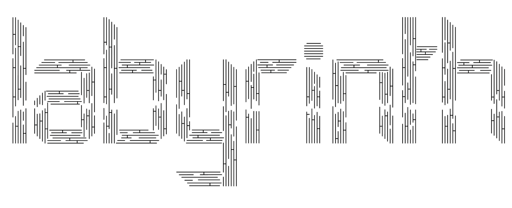
A TYPE DESIGN EXPERIMENT
Display Typeface
2023
The Challenge
Can chaos be structured?
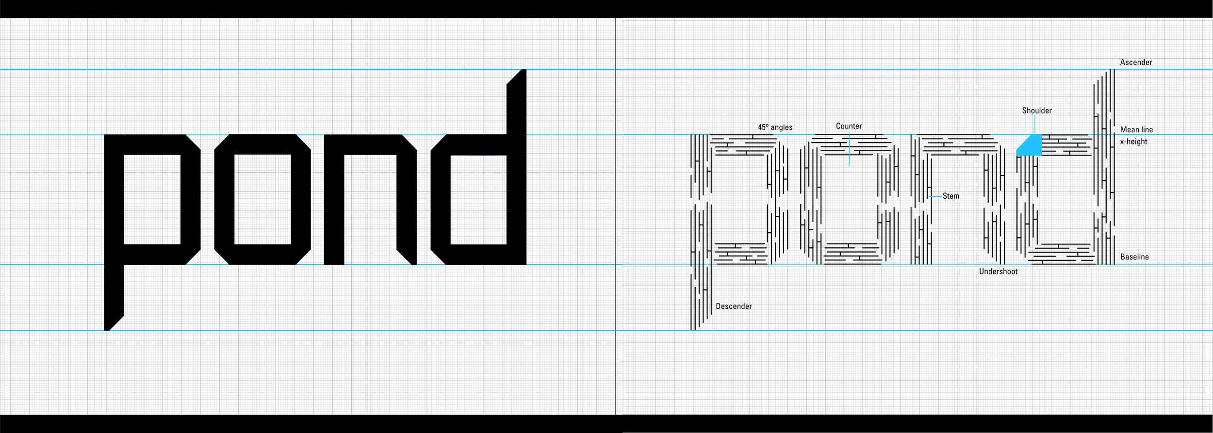
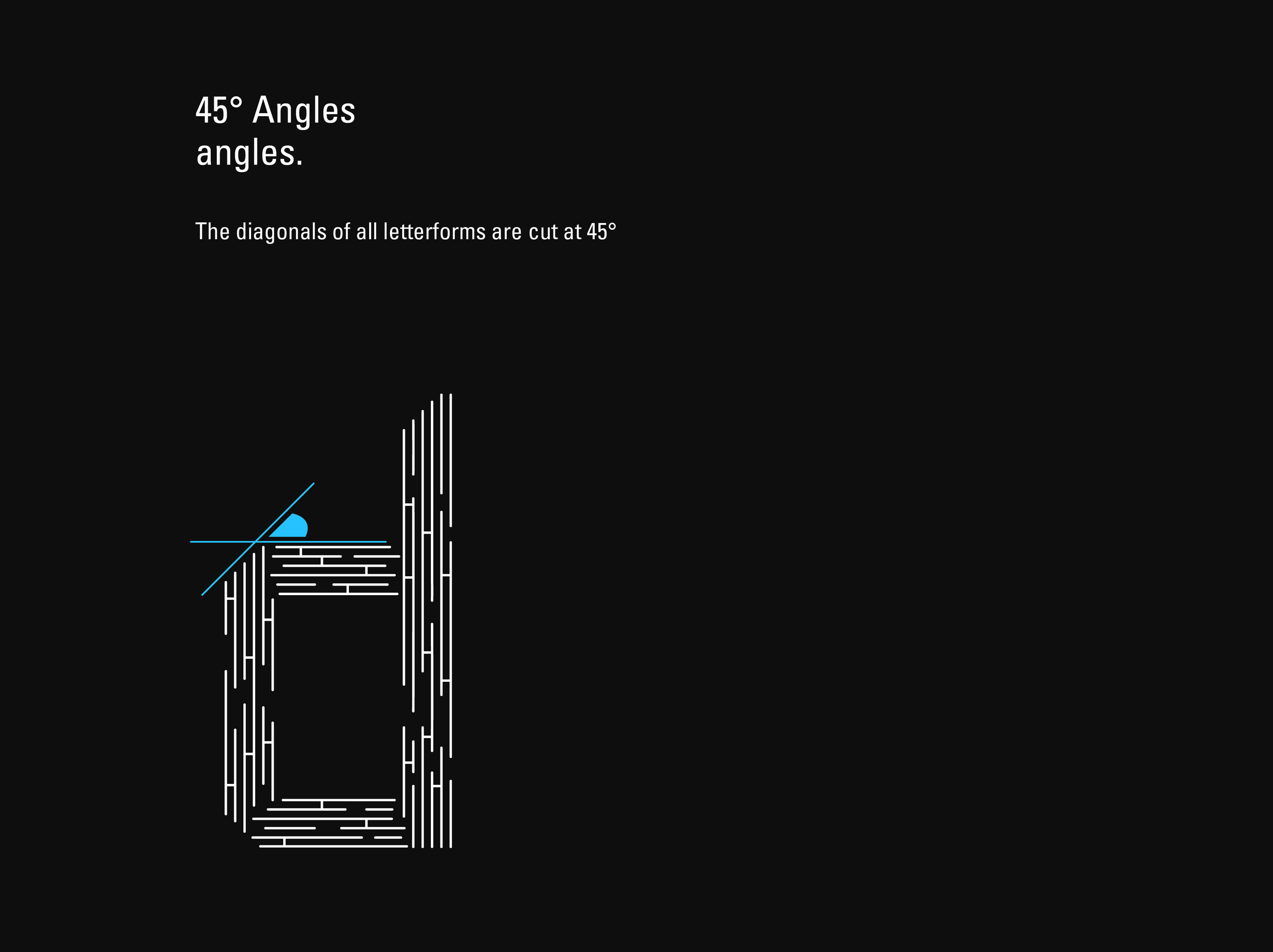
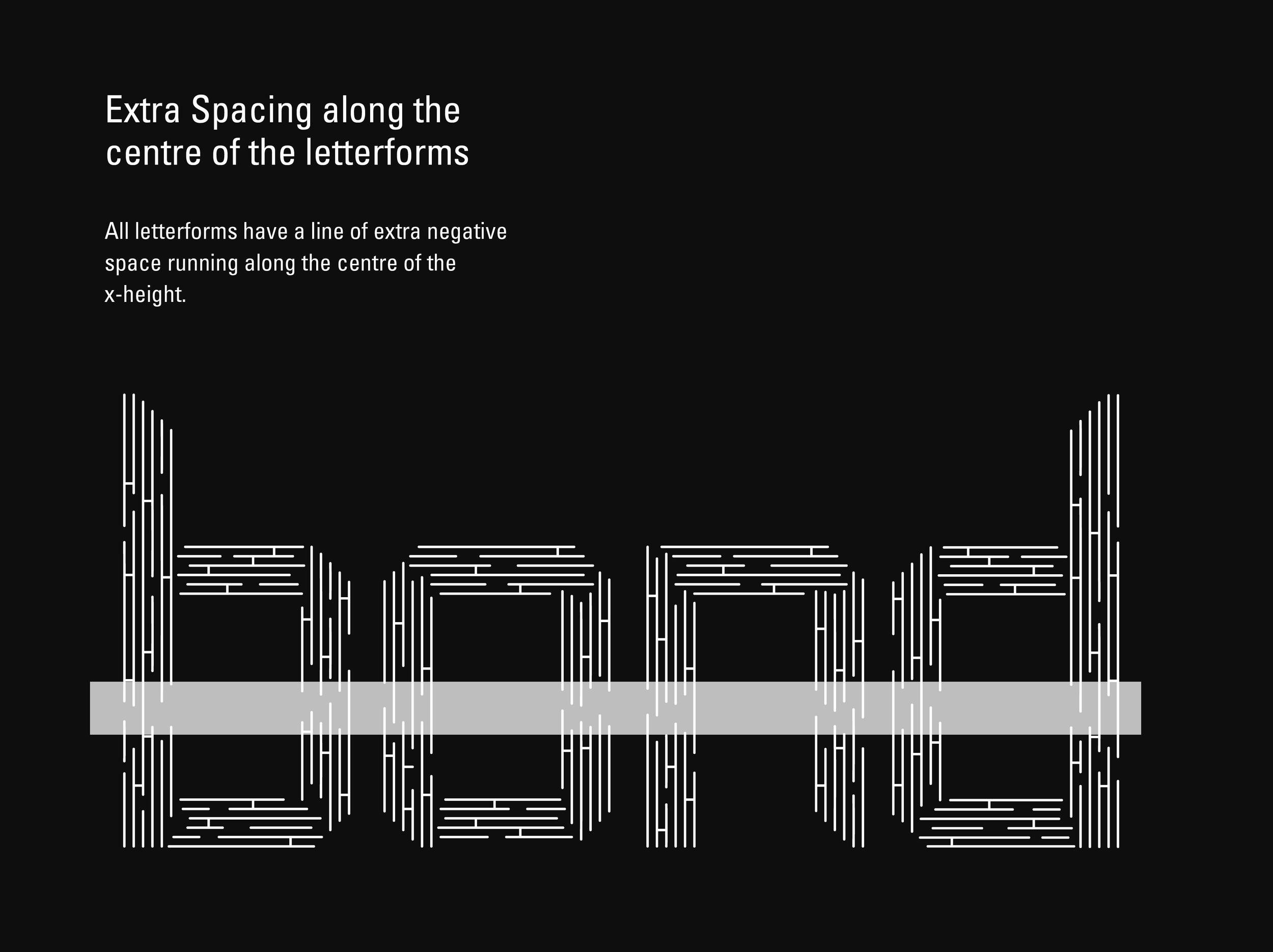
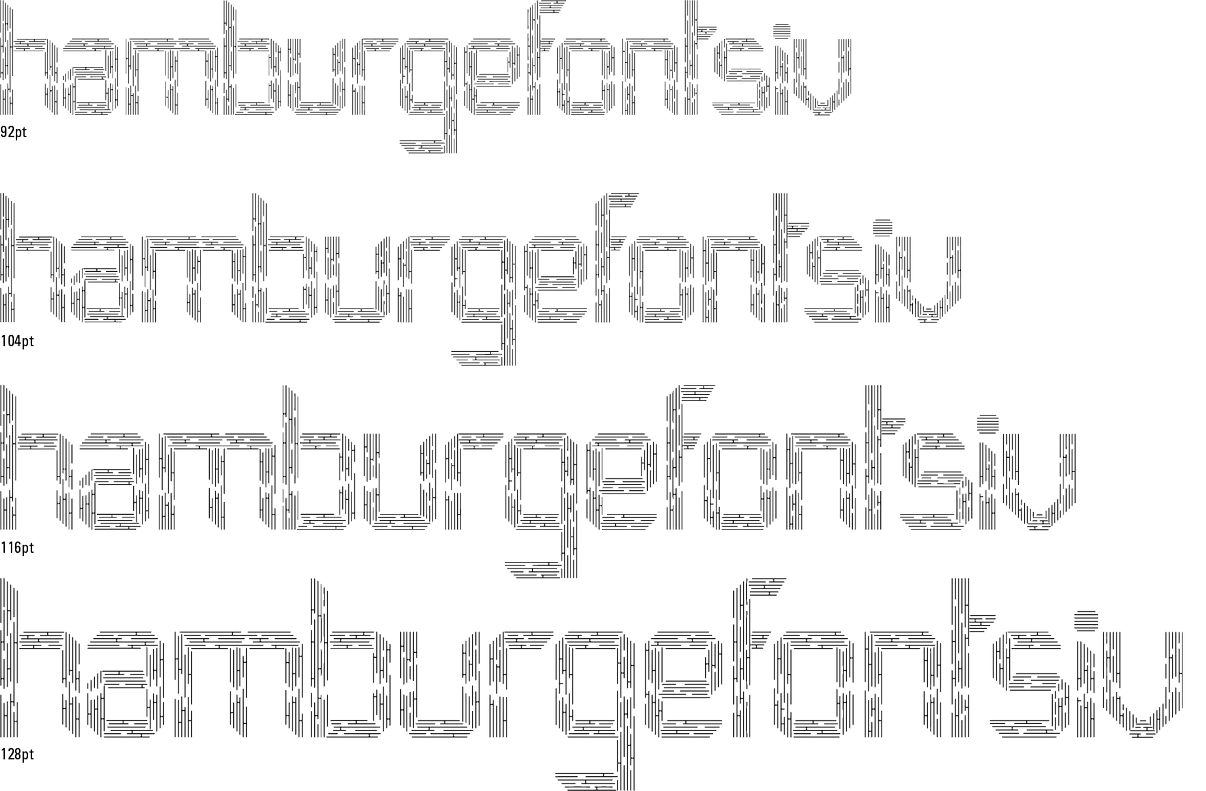
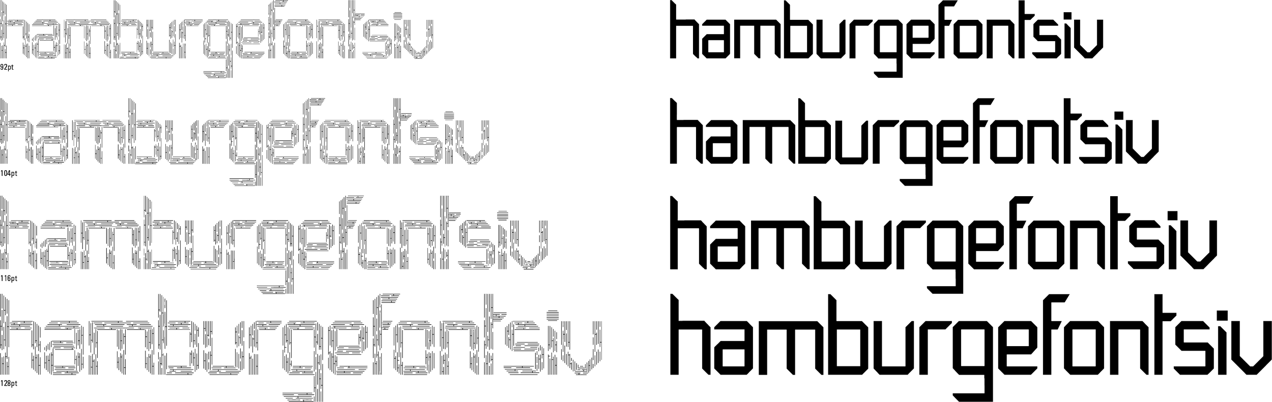
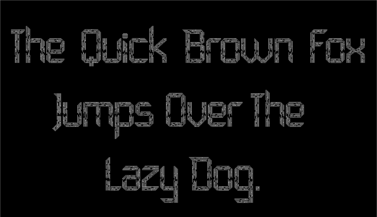
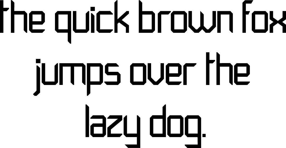
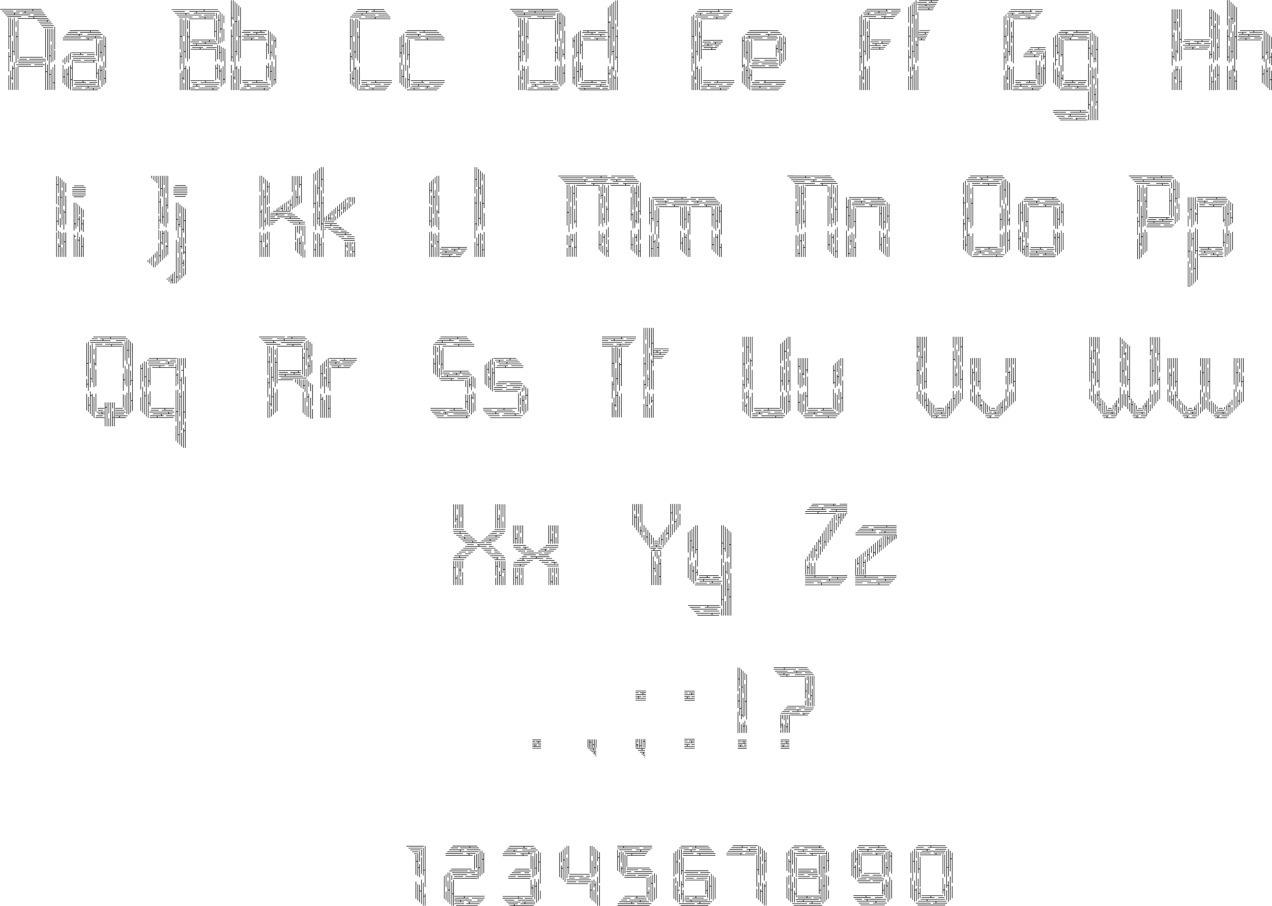
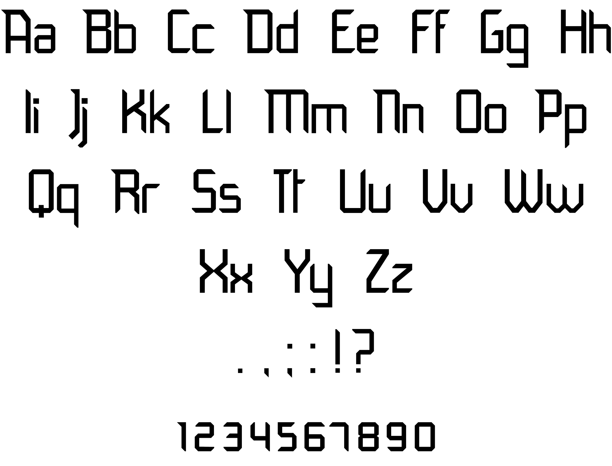
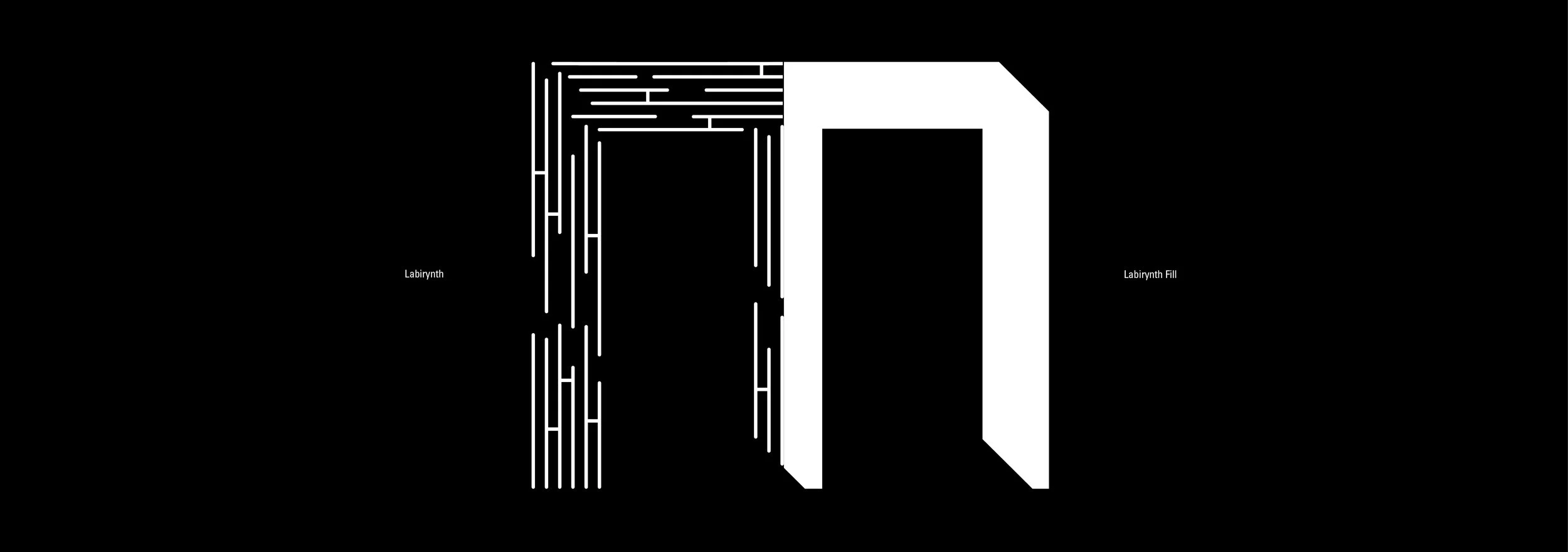
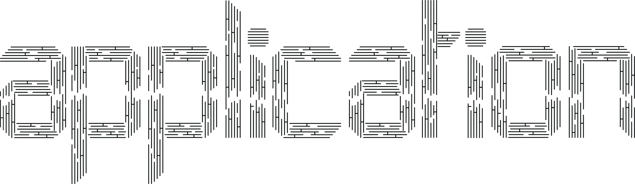
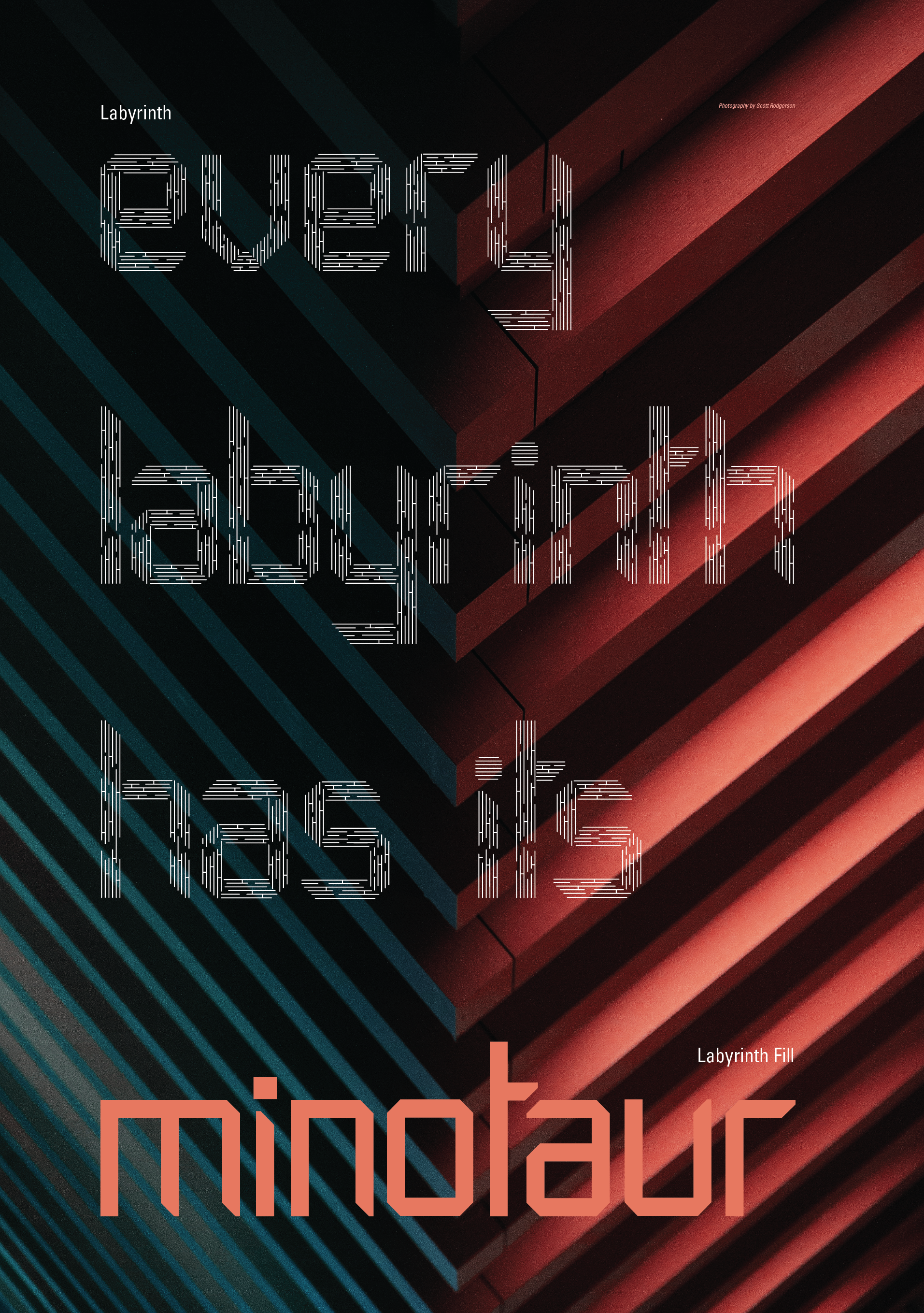
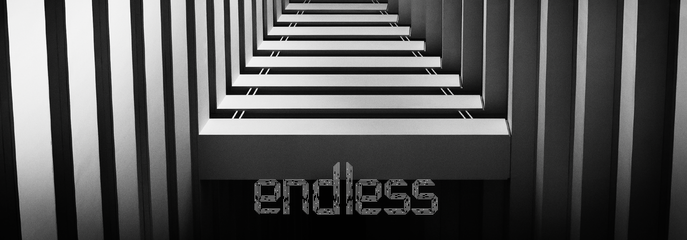
Labyrinth is an experimental display typeface inspired by the symmetry and patterns in architecture and mazes. Labyrinth is a functional typeface and an art form that captures the beauty and complexity of mazes and architectural design, bringing its essence into the realm of typography and creating a versatile and visually striking display font.
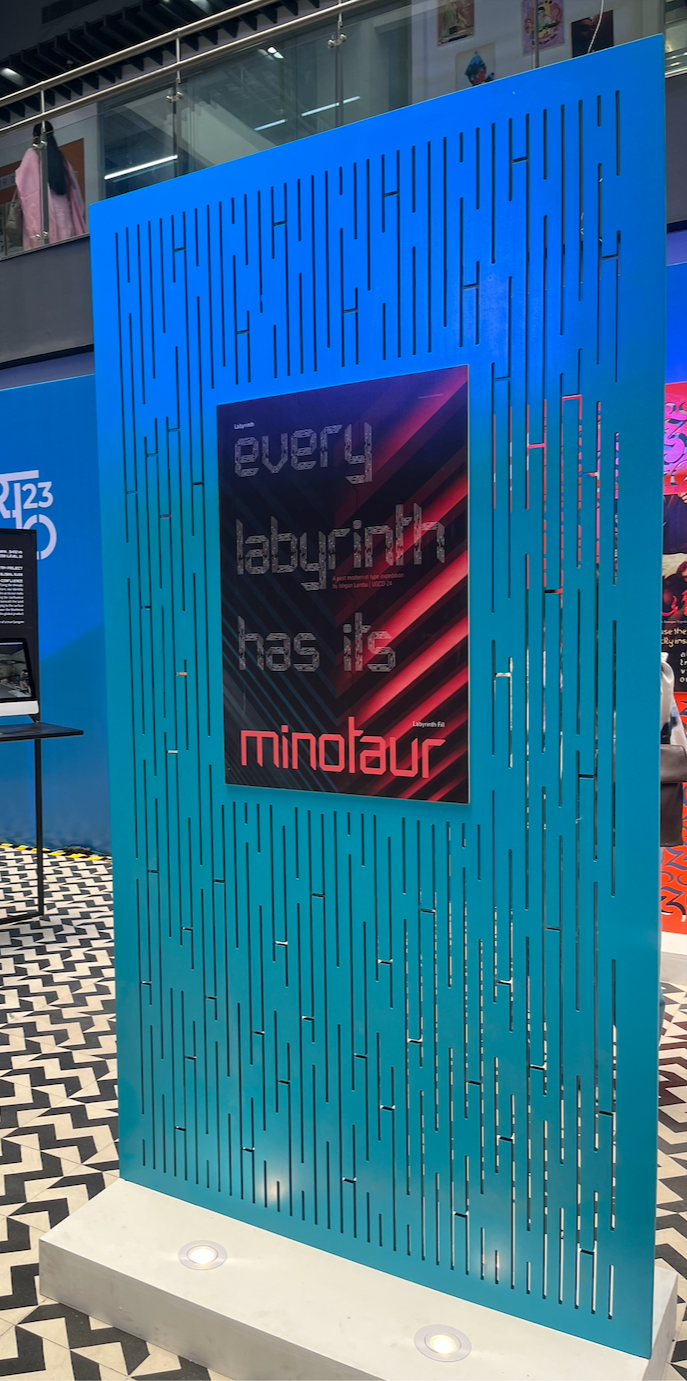
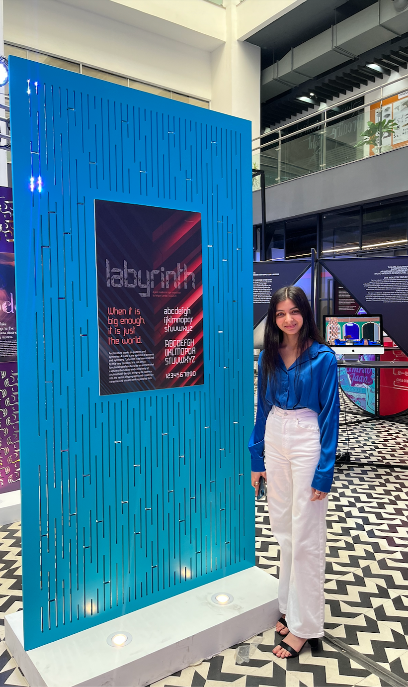


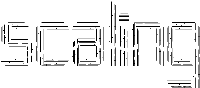
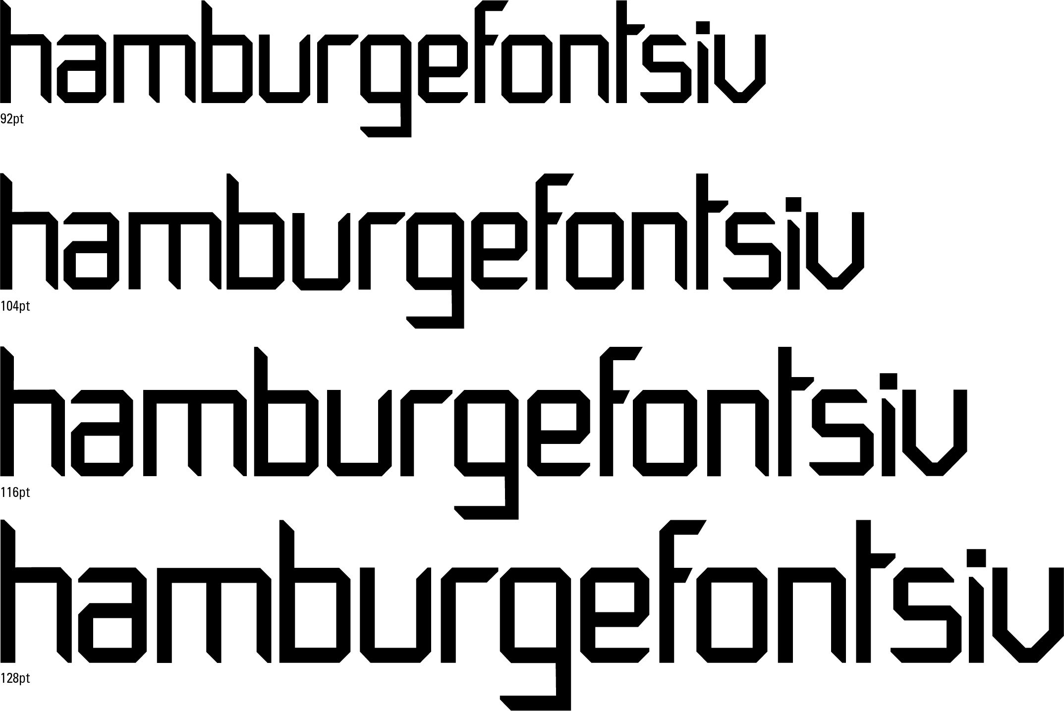
In this display typeface, the font size is measured in points. The least advised point size is 92 points, due to the intricate texture of the letterforms. Showing a range of point sizes, with the difference between each size being 12 points, i.e., 92pt, 104pt, 116pt, and 128pt.



Reflection
Labyrinth was one of the projects that made me appreciate how much patience type design requires. Starting with the idea of a maze, I had to figure out how to bring that visual language into letterforms without making the typeface difficult to use or losing its character. Working through the forms, spacing, and details was often a process of trying something, stepping back, and trying it again. It taught me to pay closer attention to the small decisions within a letter and how they affect the typeface as a whole. More than anything, the project made me enjoy the process of building something from a very simple idea into a complete set of forms.